Showing posts with label Professional Practice. Show all posts

Friday, 17 April 2015

Evaluation

Evaluation:
The purpose of this project was to create a professional business pack that could be used as a professional working photographer. Working to a brief that had set requirements that I had to produce. This included professional photography C.V, invoice, receipt, letter head and other documents that will be used for my business. As well as producing a business pack I also had to create a digital and physical portfolio of my work.

Throughout this project I carried out research that would help me fulfil the brief, this included looking at existing documents from other companies, as well as revisiting my own to update and edit slightly. I presented this research on a blog, link shown on my digital submission. This was really useful as it helped me know exactly what each document should look like and what was required on them.

Time management was something I had an issue with, I feel that my research file would have a lot more evidence in if I kept on top of it and blogged throughout the project. However I think that I managed to get on top of my time management and produce what was required to fulfil the brief.


Although I don’t really want to pursue a career in photography, and therefor won’t really need the business pack that I have created I think that it’s useful to have, and also I now have a better understanding of what is needed to be a freelance photographer. Overall I am happy with my outcome and feel that I have successfully fulfilled the brief I was set. 

Business Documents - Invoice

Below are examples of invoices that give me a good idea of what I had to create. 

 
The purpose of the invoice is to show the customer what they are ordering. I want it to be as simple as possible. I used the template from other documents I had made for the header and footer then simply created the invoice sheet.  

Business Documents - Recipt

I wanted to do some research into what other companies use as a receipt document. Below are a few that I found on the internet. I think that these are simple yet do the job. I would like something like this. However I really want the customer to be able to see what they have purchased and also how they paid. I also intend to put my logo on my document to fit with the rest of the paper work that I have created.


For selling work there are a number of things that I need to have document wise. One of these is a receipt. This is for proof of purchase and also helpful to check what the customer wants, what they have paid and also what I am sending them. It’s a finalization of the sale. My own personal receipt that I have made is below. It’s simple and easy to understand. Again it fits in with the theme of the rest of my documents.

Business Documents - Labels & Packaging

The purpose of the labels is to put on any packaging that I may use to give it more of a professional feel.  I also intend to stick these on the back of any prints that I may sell. I have placed my email under my logo in case anyone would like to get in contact for possible re-prints or any other questions. 


Portfolio

When choosing the images for my portfolio I really wanted something that summed up me as a photographer, especially through portraiture. I did however want to show a range to express my skills through this field of photography. I have gathered a range of both colour and black and white photography, as well as a mix of film and digital. I am really happy with the outcome of my portfolio. I had it printed at print space, and the print quality is well worth the money.

Below are the final images that I have chosen to be in my portfolio. This is how they were sent to print. 


Being Self Employed

Beyond the Lens - The Association of Photographers - pg.69


Thursday, 16 April 2015

Business Documents - Compliment Slips

Compliment slips:


I really wasn't too sure what compliment slips where, but after a quick Google images search I was able to find the below examples that gave a good enough idea of what I was needing to do.      


To me it basically looked like a small form that allowed you to write a little note on. Maybe a ‘thank you’ so I decided to do mine in the same style as these. However change them to fit my style and the rest of the documents that I have created.       


This was the first one that I made, however I thought it was so plain. So I decided to add a bit of colour like I have with the rest of my documents. I think that this works and again ties them all together with a running theme throughout.              

Final Compliment Slip:

Costing - Selling Prints

Costing: 

When selling your work you really need to consider the value of the print, what it is and how many you make of it. This will in turn make the image be worth more or less. the less prints made the more valuable it will be. This is good for collectors.          

Selling my prints:

When printing my work I always use the print space. This would be no different when producing images for sale. As I don’t really have a set goal for my photography career, and also want to take time out, using print space would be my only option at the moment for anyone who would like to purchase a print from me. So for my price list I have simply used print spaces prices. If I was to go into business professionally I would rethink this price plan so that I would make a profit.         


Business Documents - Post Cards

When creating my business cards, again I decided to keep the information simple. I just wanted a way for potential clients to contact me. When I get more of these printed I will hopefully have a professional blog, and also a working website to add onto the information on the back. This will give clients a means to see more of my work.

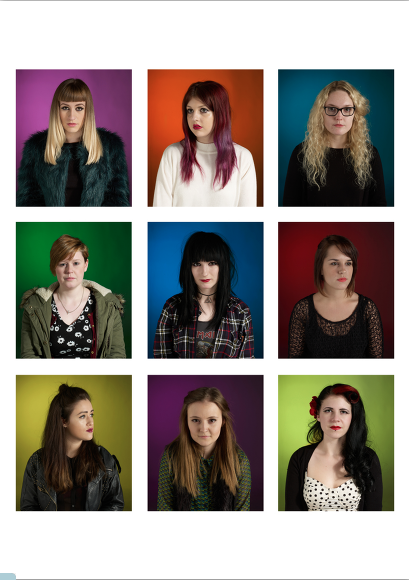
I also decide to use one strong image for all the postcards, unlike the business cards that I used a number of different images for. However the image that I did use is made up of 9 portrait images. So it does show a number of my pieces of work, especially from this series.            


Below shows the prices that are offered from Moo. I decided to get 50 card printed as this would cover my final show. I also didn't want to get too many printed as I intend to add more information onto the back. Also I might want to change the image at some point.             

Final Business Card

Below shows the final images that I chose to be on the front of my business cards. I wanted to use images that show a range of my work rather than just one style. I am really happy with the out come of my business cards. They are so much better than the last ones i had made and i think that paying that little bit extra and using Moo.com rather than Visa print really payed off. 


I haven’t put my website details on the business card as I’m not too sure if that is the domain that I will be using. However I will hopefully have this sorted for when I need more printing and then this is something that I will add on to the card.           

My New C.V


This is my new and updated C.V. This really is a basic photography C.V as I really haven’t had the experience yet in this field. I want to take some time out before trying to get a career in photography. This would be a great opportunity to enter competition, exhibit my work if possible and also maybe get some volunteer work. All this would allow me to make a more photography based C.V that will have more up to date experience and over all look better to a potential client.        

Business Documents - Artist Statement


My Website


After looking at a number of website layouts I decided to choose this one. I really like how each individual page was laid out, and thought it would be perfect for my work. It was also really easy to edit the layout to my own style. This is perfect for the time being until I am able to get a personalized website created by a professional.  


Front Page

Second Page: Film Photographs

Third Page: Digital Photographs

Forth Page: About Me

On this page is my artist statement. This is just a little bit about me, what I do and why I do it. I thought that this was a great place to put this as I have also offered the chance for people to email me and get in touch with any questions anyone may have.   

Also have linked my social media platforms to this page.    

NOTES:

Although I am really happy with my website, and I think that this may be the one I use overall, I really don’t want to pay for the domain name till I am 100% certain first of all that I want to have a website and secondly what the domain name will be. For the time being this is suitable.     

Creating a Website


I have decided to use “wix” as a platform to make my website. The reason for this is because I have used this in the past. I find this to be really straight forward to use as well as having some great already made layouts for you to use. This is a really useful tool as I’m not too sure how I want my website to look. I also financially would be able to afford to pay a professional to design a website for me at this time. So for now this is the best, and most cost effective way to produce one.

Layout options: 

My initial ideas for the layout of my website is something really simple. I want my work to be able to stand off the page, rather than get lost on it. I know its typical and what most photographers go for but I really want a white, clean website. 

This is the layout that I have used in the past. It looks really good, however it’s hard to get images on the site and they often get distorted. This is why I would choose not to use it for this project. 

This layout would be perfect and something I would most defiantly go for if I was doing landscape/street photography. However I specialise in portrait photography and I feel that it would be hard to position images on this layout. They would tend to have to be landscape. This really reminds me of the Nick Waplington website I looked at during my research. 


This is my favorite layout, I like how you have one strong image on the main page. There is then different pages that I could filter my photography into categories. 


Although I really didn't want to use a coloured layout, this one is really interesting, and really caught my eye. It seems simple to use for the viewer, all the categories are laid out really well, with examples of what will be on each page. This would be really good for my colour work, however my black and white may not look as effective. 

Business Documents - Model Release

Model release: 

Below shows my original model release form, and also my new one.  

Old:

I really like the layout of the model release form that I created in level 5 professional practices. However it has the old logo design on it. I think I will stick with this format, however add the new logo/branding onto the top of left of the page. The rest of the form I am happy with as it clearly outlines the document and what the purpose is.  


New: 

I kept the same format for the new document, however I simply updated the logo and added a bit of colour to the document. I want all the documents that I create to have a running theme throughout, this is the addition of the colour.

(This is a screen shot and hasn't worked out as well as the original document, the logo is much clearer and isn't been cut at the bottom. However for the use of the blog its ok) 


Tuesday, 14 April 2015

Making My Business Card...

What I have found to be most helpful in choosing what company to create my business cards with it that of my peers. During sessions we have been able to compare products and hear about other peoples experiences. Because of this I have decided to use the web company ‘moo’ as I have heard nothing but good reports, the prices seem reasonable and the outcomes that I have seen have been that of a high quality.


This is something that i am really going to consider. The reason being is that my minor work has all been done on medium format film and also the start of my major has too. I would however have to crop into a lot of other work to make it this dimensions. However i think that this will be different to the business cards of other, therefor making them stand out a bit more and more memorable.


Although the above would work really well for minor and part of the major, I think that this really limits the images that I can use, therefor I have decided to use a rectangular shaped business card.

Below shows how to upload and also what to consider when uploading images to create the business card. This was really useful to have.  


..........................................................................................................


Prices: 

After designing my business cards I then came to finalizing details such as paper quality. Also I then had the chance to view the pricing of the business cards depending on the quantity I wanted. This is really handy as you can see if its more cost effective to order more and how much you get for your money. I have however decided to just purchase 50 of my business cards just so I can see the quality and if I like the design in printed form. However this is handy to have in mind for future reference.

New Logo

After much thought, I decided against using a picture, or creating a logo for my brand. In the long run I would like to go into different areas of art and design and thinking ahead it would be better to do a general branding rather than it being photography specific.

Deciding to use a creative font and just having my name for my brand identity was simple enough, I didn’t want to create a name for a company and as I have already worked using my name as my brand before it seemed simple to keep it that way.

What I like about the font I chose is that it’s a handwritten font want makes it look more creative and personal. I didn’t want anything too formal, or plain. However it was really important for it to still be legible.  


I got the font of a website (DAFONT), this is a site that you can download fonts from, both for free or at a cost depending on the creator. I needed to be really careful what one I chose and had to make sure that it was available for commercial use. The reason for this is because I wanted to use this in my logo and for branding of my own business and not have any legal implications for doing so.   


I was really fortunate that the font that I wanted to use had this note attached from the creator. This means that I can use the font as I please.