Wednesday, 14 May 2014

Evaluation

This project has been one that has really tested me. I am not one at all for whipping my phone out, stretching my arm, or in fact working the mirror and taking a ridiculous picture that then gets shot on every social media site possible. The most you will get of me is some hideous drunken picture with an expression on my face that loosely resembles that of Miley Cyrus’s current antics! So when I knew I had to take a ‘proper selfie’ a little part of me died inside. 

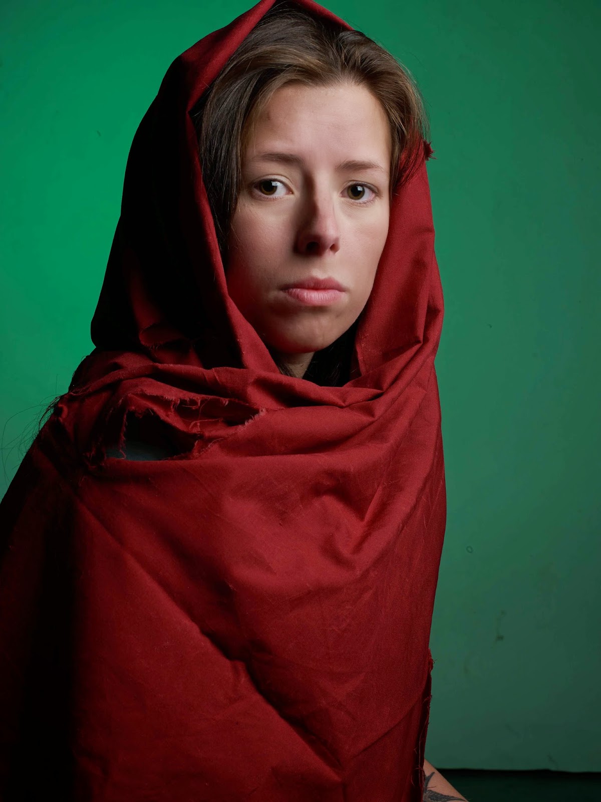
So I have a slight obsession with the Manson family, and I use the term ‘slight’ loosely. So the villain idea was rather straight forward, I knew it would be something associated with them. However a hero proved to be more difficult. I don’t really have any iconic heroes, and not ones that could be recreated. But the main issue was if they were ‘iconic’ and most were not. This was the problem! So instead of creating an image of a hero that I would have to take 10 minutes to explain who they were and what they did, I decided to do a photo that was iconic to me as well as everyone else.  

A strength that I feel I really thrived at in this project, and something I have really got into was blogging. I feel that I have done extensive research that shows examples of who I consider to be iconic heroes and villains. I have blogged about possible choices for my shoots and also people who have recreated iconic images already. I also feel that the blog has helped me keep on track and know what steps to take next. Another strength has been my time management. I have often struggled with this in the past and I feel that my work, especially blog, has suffered for this. But this time around I have kept on top of it and created a blog I’m proud of. 

A weakness has really been choosing the images that I wanted to shoot and also being happy with them. I think that it is so much harder to choose a path and follow it when you have to model yourself. I have found myself swaying between ideas and really struggling to have a set idea. Initially I wanted to create as many images as I could to have choice, but when actually undergoing the project I struggled to come up with ideas, and I literally couldn't think of any other images to choose that would be possible. 

Over all I feel that the research and preparation for the shoots in this project went a lot smoother than actually shooting and creating outcomes. It’s hard to set on an idea when you don’t feel comfortable with the project and the subject of it. I think that it has been really testing but a valuable experience that has helped me gain new skills and also a new perspective on photography. Although I haven’t enjoyed this project I am glad that I have done it as I feel I have broadened my mind and thoughts and now started to consider my models a lot more. I feel happy with my outcomes and think they show effort if nothing else.

My Final Images

Hero:
Villain: 

Self Portrait: 

The best and most iconic family - THE ADDAMS FAMILY

I think they are iconic because everyone knows the Addams family, people can recognise what they look like and I think that they are a great idea of a hero or villain in my opinion. Obviously my hero though. 


Morticia Addams

^^^^
I just love this!!

My aim in life is to be Morticia Addams and if I ever have a family this is what we will be like. She is so elegant and lady like with a quirky personality. I just love her. The styling is something that is right up my street, black is the best colour after all. She has iconic features such as her long black hair, red lips and pale face, what is something I think I would be able to work with and do really well. I think that a studio shot could really create a striking image that represents Morticia. I would have really loved to choose her to shoot but I like to do something that I think would be a challenge and I think that choosing her would be too easy and wouldn't really test me.     

Wednesday Addams:


I also considered doing this image of Wednesday. It’s simple but the small details such as hair and the styling shows you straight away who it is and has become recognizable as a ‘Wednesday Addams’ style.      

Hero Shoot 2

After looking at the first shoot that I did of this image I realized that I didn't like it and I needed to get back into the studio and do it again so that I could get it closer to the original. 


When I began the shoot I kept referring back to the last shoot I did and also the original image. after a few shots a realized that I didn't like the background colour and decided that I wanted to use a lighter green gel as it would better reflect the colour of the original image. 

Enlargements: 

This image makes me laugh sooo much! I feel like I look less like the ‘afghan girl’ and more like god damn E.T. Its the worst picture of the whole shoot i think but its cheered me up while i have been doing my blog so it has been worth it :) .                                                                                                                                                                                                                                                            hahahahha i cant stop laughing!!!
After the background change: 


I think that this coloured background looks so much better and I also think that it brightens up the whole image. At this point I also started to feel a lot more at ease with the shoot and I feel that I was able to concentrate more on what I was doing and what needed to be done.

Enlargements: 

In this image the props such as the material I was using as a vial wasn't positioned as I had wished it to be and the whole thing was just really uncomfortable. I think that you can see this through my facial expression. The background is looking better and I also like how you can see more of the green shirt under the red material. This is relating to the original.  
I really don’t like the facial expression on this image. And I also don’t like how i'm facing straight down the camera lens this is not what I wanted at all. Also the material is all bunched up below my chin, looks all cramped in. also i feel like the expression looks sad, this is a problem that i was having in the first shoot. the feedback that i got was the original was more angry looking rather than sad. so i am quite annoyed that sadness has shown through again and i will have to be careful when choosing my final image to make sure this isn't the case. 


Editing:

For the editing in this image I really wanted to try and enhance the colour of my eyes, I knew I wouldn’t be able to get it the same colour as the original but I thought making them a bit greener would make them stand out more. After all the image is all about the eyes. So I did this in Photoshop, although at first I was reluctant to do this I feel like it had to be done. I also added a ‘grain’ filter to the image to try and make it look more like film and rough like the original.  

Final Image: 

Tuesday, 13 May 2014

My Icons in Life...

Bettie Page: 

Bettie page is an icon. She is the epitome of sex appeal and beauty in my opinion. I think that she has something about her that just makes her iconic and memorable. I don’t think she gets enough credit. This image I especially like, I think that its cheeky and oozes confidence and attitude. The lighting and positioning of the models legs is really clever, due to this a shadow has been created so she isn't being exposed in any way. This is really clever and makes the image classy not tacky. The soft pose, soft hands and feet make the image also look classy, its very elegantly done. I love this image.

Lana Del Rey: 

Someone who I think has the same sex appeal and attitude as Bettie Page is Lana Del Rey. She is literally my idol and someone I really look up to. This image is great. The facial expression I love, it’s cheeky and cute. I also like the flag in the background, this adds tones and depth to the image. Quite harsh lighting used in this image. Really bright on Lana’s face.

Villain Shoot - Mansons Girls


This is the image that I chose to do for my Villain self-portrait. I decided to shoot myself as all 3 girls, as they are similar in looks and exactly the same styling I thought this would be the best one to choose, also I didn't want to choose one where that had their hair shaven off. My main aim was to really capture the expressions on the individual’s faces and how they are reacting to the situation.

Location:    

The best location I could find for the shoot was a corridor in uni. I thought that it would be perfect as in the image they are walking down a corridor too. It was also convenient and also meant that I would have help if needed and also access to equipment.     

Things to consider:
  • Needed to make sure there was enough space so that I could fit all of the girls into the shot. I didn't want them to overlap as I really am not confident with Photoshop and this would have been way too hard for me to do if they did.   
  • Need to change the position of the cross on my forehead so that it looks different on each woman. 

Shoot setup: 

For this shoot I used a digital camera on a tripod, so that the image would be easy to piece together after the shoot. I also used a flash gun as the original image was a paparazzi shot I thought by using a flash gun it would be the best way to recreate the image.  

Take One - Patricia Krenwickle 


For Patricia Krenwickle I wanted to capture her with a full smile like she has in the original image. Also she has slightly longer hair than the other two so for this I left my hair down and also natural. Her pose is pretty straight forward. Just a normal walking motion but she has got her hands like she is picking at her nails. I wanted to capture this in my image as it maybe shows some nerves or stress, this is weird because her face is telling a totally different story. 

Take Two -  Susan Atkins


Susan Atkins seems a little less happy than the other two (what is weird because she was a down right psycho). So I wanted to portray this in her expression. Because the lighting and camera was already set up I didn't take as many shots to get this image. I did however pin my hair up to try and make it look shorter and also redraw the cross on my head in a different place.  However the outfit stayed the same.     

Take Three - Leslie Van Houten


Leslie Van Houten is the girly-est of all, she was an all American girl that’s why it was so shocking and also her expression in this image is shocking because she doesn't seem bothered at all. She is still carrying herself like a lady and this is something I really tried to get across. The all American girl. Slight change to my hair so that the face was showing more and again changed the small cross on the head. 

Editing the images together: 

I found editing the images together so hard as I had never done anything like that before and I expected it to be straight forward and east, this wasn't the case at all. It took quite a bit of time to blend the images together correctly, and to sort the lighting on them out so that they matched correctly. I think that this must have been the biggest struggle throughout the project. Sadly I didn't take any screen shots throughout the process so that I could blog about them. But I’m sure you all know how I will have done it.  

Final Image:

Research - The Photo Book


As a photographer I have images that I feel are iconic, something that I find interesting and something that sticks in my mind. This is one of them images. I remember seeing it and just loving the focus on the subject but also the way that the mirrors in the background give you a sense of what the subjects is seeing and also what is going on behind the photographer. I like that it is in black and white as it makes the image simple and the use of colour isn't overpowering the image.   

Richard Avedon-

The photographer himself is a hero and an icon throughout the photography industry due to his images and his creativity, but this image especially. The grace and beauty of the slim model in front of 2 large elephants is breath takings. The image oozes class and sophistication and really rather a brave thing to do. The models elegant elongated pose really makes the image. I feel bad for the elephants that are tied down as the look distressed this is why I like the elephants more in the Rankin version below. 

This iconic image has also been recreated in the documentary by Rankin called the ‘7 images that changed fashion’. I think that he has really done a good job in capturing the image and showing a resemblance to the original, however he has still giving it his own style and touch to the image. I like this because he has still had a creative input even if it’s just a little. 

It’s also interesting that he has chosen to make the image colour rather than black and white like the original?!?  


Rineke Dijkstra- 

This photographer is someone who I was considering writing my dissertation on as I find the images created really interesting.  What attracts me to this image is the model and the location, she’s almost mermaid like and the lighting really freezes her in the frame and lights her well, creating a dark background. The model and her look, you kind of expect it to be on a picturesque beach were this is the total opposite. 

Man Ray-

Such a beautiful image. The way that the droplets have formed on the face and stayed there (makes me think it’s not water) but also the eye lashes of the model show great attention to detail. I like that it’s really cropped in to the face so you can see the eyes clearly and all the detail that they hold. The catch lights are really strong and light the eye up and give it depth and soul to the image.