Wednesday, 15 May 2013

The Polaroid Book

There are loads of images in this book and i decided to have a quick look through to see if i could find any that were relevant for this project. 


Landscape: 


I really am drawn to landscapes that look like this. They are like a typical landscape pretty and picturesque. I like the way that the trees create almost an alley way to the waterfall. I also like the location that the photographer has used its different the way that you see the waterfall falling at 2 different places.


This is what i really like, the way that there isn't a load of sky in the shot. i like the way that the photographer has got down low and shot the image so your not looking down your looking out. The line on the road also leads your eye really nice across the image. I do like however the way that there is some sky in the shot and also the mountains.

Still Life:


This is a simple image the objects are just placed in order, the real detail and what makes the image i think is the reflection's and the shadows created by the position and angle of the light. There isn't much detail in the image but i think its nice that way, there isn't loads to consider and look at.


The use of light in this image is really nice. I like the way that there are shadows covering most of the objects however the bowl in the top right must be like a strainer or something because there is holes in it and the light going through it is creating really lovely patterns on the objects underneath it. Its really simple looking.

Tuesday, 14 May 2013

Giffgaff Videos - Recipe Advertising Ltd, London

It might sound daft but these adverts really are what i would love to do with still life. The idea of throwing things or blowing them up really makes me want to try it and capture it in an image. I have tried to do this in my own way with powder paint however this is really what i would like to be doing....


Some artist that i have looked at already have done just that and been able to capture it in an image, artist such as Jonathan Knowles.

Here are some screen grabs from this video and a few of the other adverts for the same company.


Forth Contact Sheet

These are starting to get a lot more up close to the transporter. I wanted to get really close just so that i could show the scale of the bridge and also the surroundings in which it is based. 


I think that this is my favourite shot that i have taken. I just really like the composition of the image and the way that only one end of the bridge is the focus. I like the way the other half kind of just fades out of the shot. I also like the contrast between the steel and the trees. My favourite part of the shot is the sky. I have never really bothered with sky before but i really like the clouds in this one, adds tone and depth to the image i personally think.


This is the closest that i got to the bridge. It is literally at the entrance of it that's why you cant really see much of the bridge. The main reason i like this shot is that it kind of puts into prospective just how big it is when you see how small the buildings and cars are compared to the leg of the bridge. 


Taken from Port Clarence side of the bridge. I like this side better because i prefer the more run down gritty area that surrounds the bridge. I think that this compliments the industrial rough look of the bridge.  What i also like about this shot is the fact that you can see works and buildings in the background but theres just waist land in the foreground. 


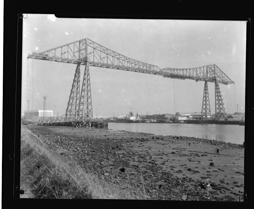
This is the only shot out of these series that wasn't taken close to the bridge. This is an example of how i didn't want to make it the main focus in the shot.


I expected a lot more from this shot. I am really not happy with it and if i had time it would be one that i would try and re-create. I don't like for a start the fact that i have captured my car in the shot, epic fail on my part! I also wish i would have went on a clearer day so that it was a lot brighter and clear. 

(Need to find book title) - Book Research

I really like this book as i think the images in it are really simple yet beautiful. I like the use of soft tones and also the colours used for the backgrounds really compliment and bring out the best in the colours of the flowers. I also really like the depth of field that the photographer has used in many of the shots, i think that this also helps and enhances the soft delicate feel of the image. 


The colours of the petals really add detail to this image. I like how they change colour and have darker details in them. It doesn't make the image look as flat and boring with this detail. I also like how the flower head is the only part that is in focus. 


This is one of my particular favourites i really do love the depth of field and how you can only see very few of the petals in focus. I also like how the leaves are really out of focus. You know what they are but there not really in your face. Its really pretty and delicate. This is one of the main cases were the background really sets off the image.


I find this interesting maybe just because of the shape of the flower. The way that the flower heads are like hanging down over. Not a typical flower. Its also really nice framing the way that the stalk is centre and everything is very symmetrical.


Saltburn

I couldn't do landscape research without visiting my favourite place that is Saltburn. I just love the surroundings and i like that it kind of has an old worldly feel to it. Whenever i get stressed or annoyed i just head down there and it makes me feel better... that's why i put it in my research as I've been there more than ever lately due to this project.


Flora Photography - Book Research

I know its such a typical route to take but i am really being drawn towards flowers in my still life project. I just love the patterns, tones and compositions created by all the weird and beautiful flowers that there is. 


I really like the simplicity of an image using a flower, especially a tulip. I like this one just the way that it look as though it is in full bloom but the way that it is hanging over the vase looks almost like it is dying. I like the way that the flower head hangs lower than the vase, don't normally see a image of flowers composed in this way. Normally all top heavy.


I feel that this really looks like a painting. The way that the petals on the flower look really soft and floaty, i cant really describe it. I really like this when an image looks more like a painting. I think that it helps give it a really classic look and aged feel.


This is one of the first images that i was shown when i started my old college and its something that has stayed in my mind. I just really like the lighting in the image. the shadows created by the natural light and also how it highlights the vase and the flower and also the stairs. Very simple, and has a rather geometric feel to it.

Third Contact Sheet

For these images i wanted the transporter to not be as noticeable as in other images. I wanted maybe for it to just be in the background or just showing a part of it. I didn't want it taking up the whole frame. This is why i focused more on the outskirts then worked my way in with the shots.


I think that this is a really interesting angle to capture the bridge. It really does look like some beast moving over the land. I also like the road in the shot and the dirt track, adds to like a abandoned unreal feel to it. 


This again has came out really dark. I really like the clouds though i think they really create a moody feel to it. I also like the way that the bridge is partially hidden by the tree. I don't want it always full in every shot, i want it to vary. 


I like this one because i like the way its mostly hidden by the trees. I also like the composition and how i have got the road name and sign in. I think that this is too dark but hopefully i will be able to sort this out in the dark room for my enlargement. 


I don't really like this shot, i just think that there isn't really anything going on in it. And i would maybe would have liked it if the bridge wasn't so central. Maybe also if i chose a side to focus on as there was some really interesting works on either side of the road and i don't think i took the opportunity to capture this.


This image you can hardly see the bridge however when i in large the image you can see that its there. I did this so that you can see how it effects the landscape. This one looks very derelict and lonely but when you see the bridge makes you think that there are people close by and its not in the middle of know were.