Monday, 10 December 2012
Quick Question
when you guys are all putting images that you have shot into the blog are you going to put a mini contact sheet in?

Wednesday, 5 December 2012
Notes
At the minute i seem to be looking at older style portraits rather than more up to date images. But i think that this is really helping me get a sense of what the basics are in a portrait and what i can use to help me make images that i really like. Also I'm drawn more to older images, i think that they are unique and have a eery feel to them.
Hopefully i can start to look at more newer images and pick out ones that i can work with and help me create colour portraits in a style that i like. Have a long way to go to get more up to date though.
Hopefully i can start to look at more newer images and pick out ones that i can work with and help me create colour portraits in a style that i like. Have a long way to go to get more up to date though.
Daguerreotype
I think that the Daguerreotype creates a really simple portrait but the format in what its been created makes some really Gothic and creepy images that i really like the style of. I also like the fact that these are one off images. Makes them special and unique.
''The daguerreotype process was the first
practicable method of obtaining permanent images with a camera. The man who gave
his name to the process and perfected the method of producing direct positive
images on a silver-coated copper plate was Louis Jacques Mande Daguerre,
a French artist and scenic painter.'' http://www.photohistory-sussex.co.uk/dagprocess.htm
 |
| Mathew Brady |
 |
| Of - Edgar Allen Poe |
This is my favourite of the daguerreotype images because its just creepy and i think that it is a really strong image. I think that it adds tension and gives a Gothic feel for a few reasons. One being the way that the subject is staring with this evil glare right down the lens. Another reason is because of who the image is of and what he is known for. I even like the marks on the image around the black areas of it. I think i prefer the scuffs and scratches there.
 |
| Mathew Brady - 1844/1860 |
Johnny Cash - God's Gonna Cut You Down
I have decided to use this video as part of my portraiture research because it contains a lot of celebrity's in the video. The video itself is made up of like a stop frame animation almost and during it stops and shows a portrait image of quite a lot of the celebrity's. I think that this is really nice because it shows you detail in the faces and also has really nice framing and composition. So i have pulled a few of these images out of the video to see clearly and easily.
 |
| Johnny Depp |
I think that this is my favourite image from the video. I think that the lighting is really soft on the models face and i like how he just appears out of the darkness, kind of loose the detail of his hair. Also the small catch lights in his eyes make them pop out of he image and give life to the subject. Also like the tone of the image. its not exactly black and white.
 |
| Kanye West |
These images seem really cropped into so that you can see all the details in the subjects face. I think that this is so that you can almost read the emotion in the face. Its in contrast to the rest of the video what seems almost jumpy and busy. The parts that show the picture tell the emotion.
 |
| Kate Moss |
I think that in this image model looks a bit lost and you loose the details in her eyes. Also its quite dark no really shadows or highlights like the rest of the images. Over all quite flat.
 |
| Keith Richards |
 |
| Iggy Pop |
 |
| Bono |
This is the unique one in the video mainly because its more fun and not as serious as the rest. I think that the other images have a lot more feeling and emotion in them and i don't really know what this one is about. Could you even class it as a portrait with the fact that you cant see the eyes? i don't know i don't think i would.
Portraiture Paintings
I want to look at paintings because they really are the first type of portraits and it will show what a traditional portrait was like and the feel that the image had. Also portraits in the Renaissance period started to get a lot more advanced and became almost more photographic in the detail that they captured.
 |
| Antonello Da Messina - The Announcement 1475 |
 |
| Giovanni Bellini - Portrait of Doge Leonardo Loredan 1501-1505 |
I think that these are really good images to reference because they really start to capture detail in the models faces really intricately and also the use of lighting and how it effects the image and the shadows and highlights it creates on the subject. Shows the advances in paintings to the point were they are almost becoming photographic.

Also some of the most famous portrait images are paintings. For example the Mona Lisa by Leonardo Da Vinci -1503-1519. This has started to incorporate land like old capitalist American portraits were people used to get them to show off the wealth, however i think that this is done in a more scenic way to make it appear like the model is sat in this location. Shows lighting on the model and all the detail such as shade, highlights and facial expressions. But also perspective in the background, by the way that the road vanishes into the distance and also the loss of detail in the trees.
Julia Margaret Cameron
These are two of my favourite portrait images by Julia Margaret Cameron. These were not shown in the book that i used previously as part of my research so i decided to put them in separately. I this that they have both got a Gothic, creepy feel to them what i really like.

The fact that this image has quite a close crop makes you see the image clearly. It maybe might have been too dark if it was not as focused on the models face. The lighting is really soft on the face and doesnt really create dark shadows, unlike the image below.

I especially like the way that the light is hitting the model on this image. Really highlights the features on one side of her face and makes the model really stand out from the back ground of the image. Appears to be a quite shallow depth of feild to the image because you can see that the models hair is blurred and so is her neck. This makes you concentrate on the models face more rather than the hair and neck/shoulders.
Tuesday, 4 December 2012
Thomas Ruff


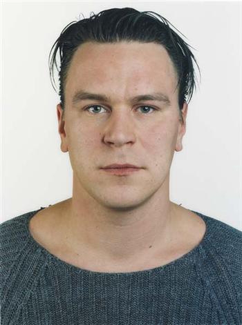


I decided to put these images in as research because after our first lesson on portraits this is what i had in my head of what a portrait should look like. However there has been a debate that these arnt portraits. They don't have any feel or atmosphere to them. There basically just passport photos.
'Ruff embarked on a period of research into the history of portraiture and carried out his own experiments with composition and framing. He decided on a style of portrait that would be as neutral as possible, with the aim of emphasising the face of the sitter. Ruff requested that his models try to be expressionless, and each one was photographed wearing their ordinary clothes, against a plain background' - http://www.tate.org.uk/whats-on/tate-liverpool/exhibition/thomas-ruff/thomas-ruff-portraits
I do however feel that they do give you a feel of what the person is like because you do see there clothes and i think that you can tell quite a lot of a person on the basis of what they are wearing. So maybe this is something that i could think about in my own portraiture work. Its not always about the facial expression, could be clothes, accessories (as long as its there normal attire, don't want to get too fashion-esq)
Subscribe to:
Posts (Atom)