Wednesday, 28 November 2012

Julia Margaret Cameron - From Life

I took a book out of the library as i knew that Julia Margaret Cameron did a lot of really nice early portrait shots. The book was called 'From Life' however this was not what i expected it was a lot of words and only minimal images so i was only able to find a few nice portraits that i liked. 


This image is the lightest out of the 3 that i have chosen from this book. I really like the way that the young girls face is framed by the white sari that she is wearing. She doesn't look as dark or creepy as the other two images. Gives a feel of innocence and purity. She doesn't however look very happy. Maybe this is because she had to stay still therefor had to keep a straight face?


What i like about this image is the way that the man appears from out of the shadows. Its really dark and has a kind of creepy feel to it. I like the way that you cant see where his body is its only his face in the light. There is really nice lighting hitting his face from the left hand side what highlights his features on the left side but isnt bright enough to highlight his body or most of the right side of his face.

Friday, 23 November 2012

National Portrait Gallery - Queen Elizabeth

I was watching the news the other day and it showed a range of Andy Warhol images that he had created of the queen. It was part of a gallery she is putting on (or something) and it showed a few other image of the queen and i immediately thought that this would be good to put in research for my project. 

Queen Elizabeth II, by Marcus Adams, June 1927 - NPG  - © estate of Marcus Adams / Camera Press
Marcus Adams
I really like this. Thought id choose a range of ages and show how they have changed, or show how certain aspects have stayed the same. There is light hitting the back of her head creating a glow from her hair. Gives a kind of innocence and purity to the feel of the image. Also looks like a real shallow depth of Field because only really her eyes and face features look in focus.

Queen Elizabeth II, by Yousuf Karsh, 1951 - NPG  - © Karsh / Camera Press
 Yousuf Karsh
Really like the lighting on the front of the Queen in this image, you really get a lot of tone and shades due to the light hitting the silk on the dress. It also makes the necklace and the crown really shine. Again there seems to be a spot light hitting the backdrop making her appear with a glow. Also there looks to be light reflecting or maybe pointing onto the back of the Queens head what gives that kind of old Hollywood feel when highlighting the back of the hair.

Queen Elizabeth II, by Dorothy Wilding, 1943 - NPG  - © William Hustler and Georgina Hustler / National Portrait Gallery, London
Dorothy Wilding
This one i have chosen because there isn't so much fuss with lighting on the back drop as there is in the other images. There doesn't appear to be any soft lighting to highlight the back of her hair etc. However i think that there may be 2 lights or a reflector to capture the bright light all over her face. There isn't really any dark shadows. The face looks really soft.

Queen Elizabeth II, by John Swannell, November 2001 - NPG  - © John Swannell / Camera Press
John Swannell
This image looks as though the back ground has been lit separately and that the Queen is stood quite far away from the backing as she appears to be really bright and stand out in comparison to the background. Also looks like there is a spot light aimed at the back (maybe just behind the Queen) to create this glow around her. Also gives a kind of importance to it.

Terry Richardson

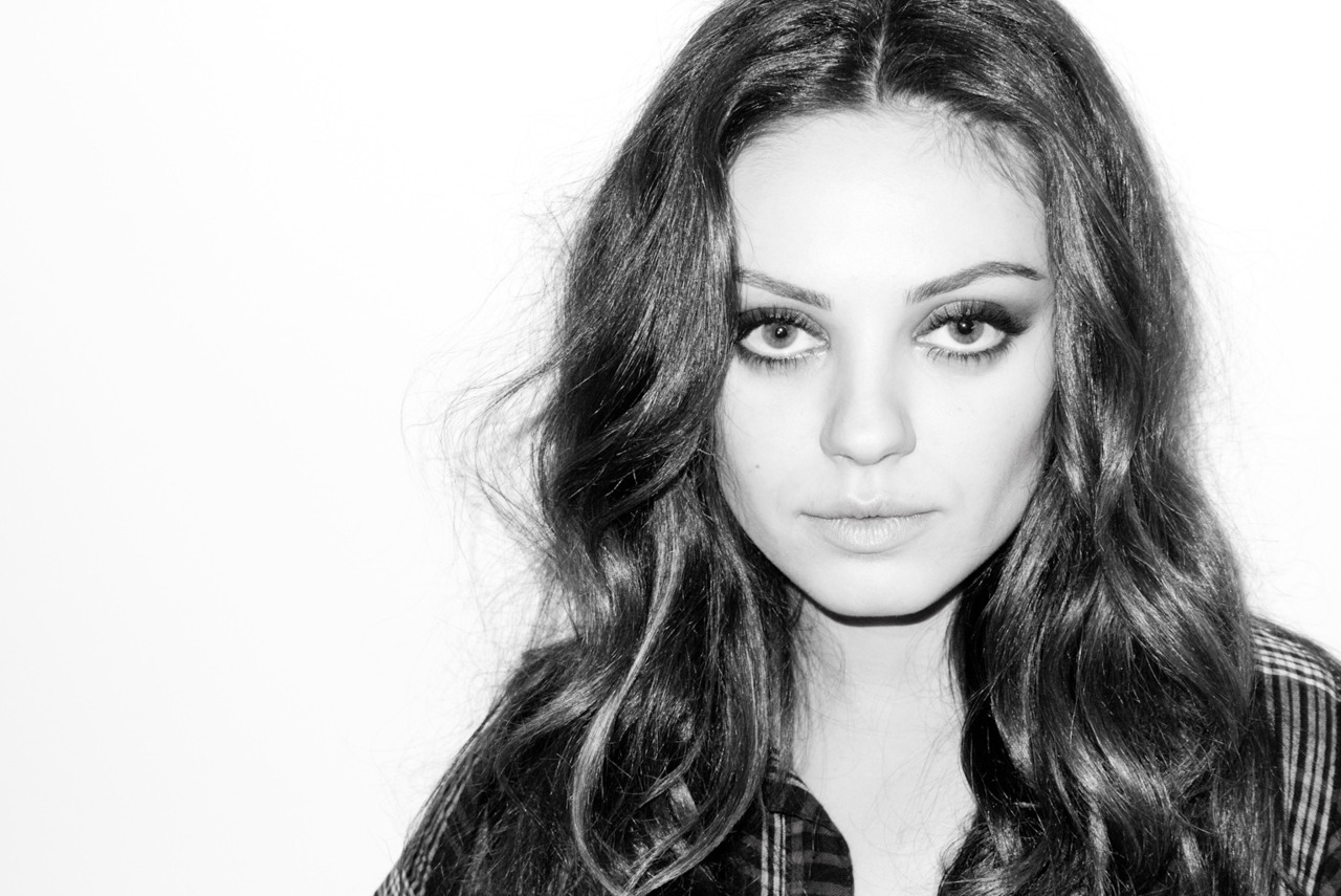
Something that i really like (what i didn't think i would) is the framing of the images below. I like the way that they are more to the right hand side of the frame and that there is a area of negative space to the left. This is because the image has been taken landscape were you would normally expect it to be portrait format. 
 
Terry Richardson - Charlotte Free
 
Terry Richardson - Mila Kunis
Also the lighting in these images makes it so that there is no shadows on the models faces. There isn't really a contrast. You can see all the details of the face clearly without loosing detail. This is created by using a flash straight in front of the model. For example the flash on the camera. Does however create harsh shadows around the model that show up on to the back drop.

Blue Steel


Shoot - 1

After today's session had finished during lunch i decided to do my first shoot using Rachel as a model. We used the studio one cove, with 2 strobe lights hitting the back drop with reflectors bouncing the light back onto the white background. Model stood in front of these reflectors with a soft box pointed at her from both the left and right (alternated during the shoot) I feel like the shoot was going smoothly and managed to get the camera focused right pretty much all of the time. However i forgot to do a test shot holding the card i would use late to add the right custom white balance. So below is an image from the shoot and then I'm going to go back and do the shot so i can get the right white balance.


Image One
I like the image. I think that it has been framed really nicely and i also really like the expression on the models face. However i feel like her skin tone just doesn't look right and also the back drop looks a bit gray so i think i need to go back to do the test shot to see if this will change these faults.

                                               1                                                             2 

                                            3                                                                 4

5

  1. As these were some of my first shots i wasn't expecting too much, just having a play around. Harsh shadows. model looks orange (what she clearly isn't) really like the colour of the backdrop and the lighting that's hitting that. Also nice catch lights in the eyes.
  2. I think that this is a really nice pose and i like how she is leaning towards the light with her hair scraped to the side. I think that the light is hitting her features better in this image. She looks rather girly.
  3. Only see one side of the face. I wouldn't want it for my images but kind of like it in this shot.
  4. Far too dark hardly see any detail in the models face. 
  5. I dont like the framing of the image. Too dark again. Background lighting is nice though. Like the models face and really nice light in her eyes. 

David Bailey

....I have decided to re-post this post as it is relevant tot he work i am doing now....

There are a lot of these square medium format images from David Bailey called 'A Box of pin ups'. I decided to look at these 2 thought because it shows both a single image of one person and also a group.


Mick Jagger - David Bailey, 1964
To me this image kind of looks out of focus (but im not too sure if its just my dodgy eye playing tricks on me). I like the framing of the image and how the top of the models head is slightly cut off. Also like how the arms lead off the end of the frame too. I dont really like it if there is a bit of a white edge to the image.

The Rolling Stones - David Bailey

I like the idea of a group portrait. I think it gives a little something different to the usual set up. I also really like the lighting in this image. How you kind of loose the detail on one side of the models faces because of the such harsh lighting coming from the left of the frame. 

Saturday, 17 November 2012

Paolo Roversi - Are all fashion? (mini rant)

would all of Paolo's work be classed as Fashion? I understand if there is over the top makeup and hair done, for example the one below..

The Shining Paolo Roversi

But i just don't see how simple images that look un-styled and really quite natural cant be classed as a portrait? fair enough you could say the clothes she is wearing are being advertised but what do you expect her to wear?
I just cant get my head around this and I'm really finding it hard right now to get this  project and what I'm meant to be looking for.