Friday, 9 November 2012

new york city street photography - by guido steenkamp


I thought that this was a really interesting video/slide show that i found on youtube. i really like the images that this photographer has captured. I like the range of quite busy images and images of lone figures. I thought that this was a great help because it is exactly the type of images that i should be taking.

Print Screens:

These are just some screen grabs of some of the images i particularly liked from this video.


like the movement shown by the birds. Also think it is really nice how still and frozen the image if the carriage is. lets you see the detail in the peoples faces. Really nice lighting, gives the images a natural glow. Also is nice how the cart is positioned in the light area of the street, this lights up the cart and the people in it. 
 

i find this image really simple yet beautiful. i like the way the light is hitting the man to illuminate his face and also create this really long shadow behind him that takes up the rest of the fame. the simplicity of it is what i like most of all about it. That there isn't anything going on in the background that distracts you.


i like the crop on this image. you cant really see the location around the subject so you have no idea were it is set or located. The name on the back of the jacket though makes you think that its in New York. I think that this is a really nice subtle touch. 

Portrait Progect

I actually cannot wait to start doing portraits. Paolo Roversi is by far one of my fave photographers

Palma Violets - Best of Friends (Official Video)

Palma Violets makes blogging easier...


Stephen Cosh

In the images below i really like the use of lighting. I like the way that the lady really stands out from the dark surroundings outside the shop. I like the contrast in the image also think that there is quite alot of detial for a night shot and it isnt blurry or has movement. (im assuming it is a night shot)


Saturday, 3 November 2012

Contextual Studies

I am reading through my notes that i have taken from Wednesday and i found it so interesting that when i took notes i must have been too busy listening to write anything that makes any bit of sense! however I'm actually quite glad because now i can hit the library and find out loads more interesting things about the Renaissance period. I'm rather sad i missed the week before lecture however i cant wait for next weeks lecture..

Contact Sheet - 8

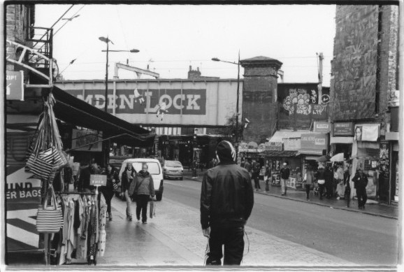
Again this roll of film was shot in Camden Town. Some of the pictures look a bit too dark. However i think that there is some nice images. 


Enlargements: 


Its nice that this image has been shot from behind the man because its almost like you are seeing what he is. i like what is going on in front of him the image is busy and has a lot of detail but the street isn't busy with people. these are the kind of street photography images i prefer, focused on one person rather than a big group. 


I don't really like this image. it looks blurred and out of focus. there also isn't enough contrast in the image, have even tried adding some in the dark room. I like the image of the children. I wish i focused on them more and cropped the people around out as i think they are slightly distracting. I also don't like the way that the man on the left is chopped in half. 


Damian Brandon

I was trying to find some research that kind of resembled an image that i had taken of a homeless man in London to see how it compared. However when i was looking on google images i came across this by Damian Brandon what i find really quite beautiful. I like the soft tones in the image and how it is not too contrasty. I also like how he has put a boarder around the images and a little title at the bottom, i think that this adds a lot more to the image. Don't really like the addition of his website though. 


i decided to have a look through his blog what mainly seemed to be wedding, family based pictures what although nice didn't really interest me. So i decided to go onto the website instead were there is a bigger range of images to see more easily in stead of traipsing through his blog. 


This is another one of his images i find beautiful. I think the shadows add detail too the image. I think without these it might look a little flat. I also like the idea that the ladies head has been cropped out. Shows just a small bit of her but you can kind of get a feel that she is a fashionista.