Friday, 15 May 2015

Evaluation...

Thinking of a subject for my major project was something I really struggled with. I genuinely thought that I would never get there. However I feel like it was staring me right in the face the whole time. It literally took me to sit and stare at my blog before I got there. The background of my blog was my inspiration. Pigeons! That was it, something I have grew up around, had in my life as long as I have lived, and something I’m interested in. not only was it something I felt like I could explore and get engaged with, I also thought it was a way of me truly expressing myself. Projecting my feelings through my images, and telling the world in a sense, what I am afraid to say in person. What I’m trying to tell you as a viewer is that I’m confused. I have come to a point where I have 2 choices. This is what I wanted to get across in my images, hence why I have 2 sets within the final prints.

The only issues I ran into within this project are to do with choosing a subject matter. This wasn't something I could really solve overnight, it took time to get inspired and motivated. This did however cause a lack of time management, and often meant that I was unable to get involved with early group crits. However I don’t mind this as I wouldn't have wanted to choose a subject that I felt would have lead me to get bored. I’m glad I waited and came up with something I’m happy with and feel like explored exactly how I would have liked to. I also had a minor issue with what format to produce my images. I really was wanting to do 120 medium format film, this however became an inconvenience as I couldn't gain access to the required camera, and also became rather expensive. I solved this problem by switching to 35mm film, what I am really happy that I did because it meant I got a lot more images for my money and I really like the look of 35mm prints.

I think my key strengths have been really working on my darkroom skills and producing a set of prints that I am really happy with and that I think are at a quality that will ready for exhibition. I also think a strength is my research and experimentation, not so much artist research but researching my subject matter, and exploring different shots, finding influences, and really having a good explore in the darkroom.

Something I have often lacked is motivation throughout the last 3 years, however I feel that in this project, although it took me a while to get started I truly felt I could express myself, and I felt fully motivated, and I hope that shows through my prints and also my blog. I want people to understand my images, to be able to see the difference and then make a judgment for themselves on what is better. I truly think that the Bob Dylan quote speaks volumes about my work, and therefor will be incorporated in my hand in.


Overall I am so happy with my final prints and think that it has accomplished what I set out to achieve. If I was to do it over again I would just hope that I could have known the subject matter sooner so that I could have explored more, possibly different techniques and also done more shoots.

My Final Images...


Tone...


The use of filters really makes a difference in a print. It really pulls the black tones out of the image. However this can also be a bad thing as you can lose detail in the blacks if too high a filter is used, or too long of a time. The left image shows how I left the timer on for too long and all the detail in the black areas of the image have been lost. This overall makes the image look really dark, as well as the whites being too ‘in your face’. What I decided to do is use the same filter (3) but just simply do less time on the image. This is shown in the right. I like this so much better and think the image has great contrast without losing valuable detail in the image. 

Final Prints Set Two...

This is my second set of images. The idea behind these images is that they represent the pigeons that live on the streets ‘street peckers’ as they are known. This was more street photography in nature. This is to show more freedom, but also question if they are truly free. 


The most important aspect of this set was to have images of birds flying and roaming around. This is in contrast to the first set where they are in cages, and being handled by humans. I wanted the framing and also the printing techniques to be exactly the same. So these images are also contrasting, and have really clear tonal quality to them.

Framing...

The framing of an image can truly make it a better print. This is something I have had a few thoughts about throughout this project.

My first thought was to simply have an inch boarder round the whole image, that would mean cutting the paper down after printing. This would be easy enough done, however it could have meant that I had images that where slightly different sizes to each other. That I wouldn't have wanted.

I decided on having an inch boarder round 3 of the sides then the negative space at the bottom. I thought that this would work really well. I like the idea of negative space, the reason for this is because when I frame my images I want there to be a space, almost a mount, and I also wouldn't want the whole thing to look too busy and cluttered. I think this would have been the case if all the boarders where the same width. 


Above shows how I set my print board up ready for my images. The negative space would be at the bottom. This was easy enough to set up and really made my images look classy and added to the contrast (I personally think).  This was also helpful in case I needed to re set the frame in case someone changed it. Luckily that didn't happen. 

However that didn't mean that I didn't run into any problems. I did, below shows one of the main problems I had to do with framing. 


Often when framing my image I didn't want to enlarge it so it cropped any of the image out. This would mean that the edge wasn't as sharp and straight as I would have liked. This really looks unprofessional. I really didn't want this so in the end I had no choice other than to slightly enlarge the image, cutting off a tiny amount of the image. 

Exploring: 

Something that happened accidentally while printing the darkroom, I was tired and wasn’t really thinking about what I was doing. I forgot all about changing the framing and in my head at that moment I was still thinking I was cutting my prints down. Because I had this in my head I printed my image upside down. This meant that the negative space, and the large boarder was at the top of the image, with the inch boarder at the bottom. This was not at all what I wanted HOWEVER I then began to think, what if the pictures of the pigeons that are on the floor, or caged where to be framed like this and the ones where they are free where framed properly? This would distinguish the two groups of images, but still keeping them together.

This is just an idea that if I have time I will explore more.  

Darkroom Problems...

Some problems that I ran into when in the darkroom and enlarging my prints where problems with the negatives. This was really frustrating as there wasn't really anything that I could do to solve it.      

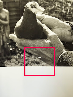
One of these problems was scratches on the negatives. This is frustrating, however the more I seemed to try and solve the problem the worse it got. I also tried to burn the scratch in to try and not make it as noticeable. This is one of my final images, I really had to consider if it was really one I wanted to use because of this scratch. But I really liked the image so I decided to go ahead and use it anyway. There are things that I can do to the print to solve this problem after printing however I don’t really think I want to be messing with my prints. I would rather leave it as it is.         

Another problem was just weird marks on the negative, and also streak lines. With this shot, the mark is really visible, clearly something that happened while processing the image because looking at the negative it doesn't seem like a scratch. I also used a device to get dust of the negative. So it clearly wasn't dust either. This is a shame, but has taught me to be more careful in the future with my negatives.  Another thing I had issues with was streaks on my negative. Although I washed my negatives correctly and left them to hang dry, it seemed they all had water marks and streaks on them.   I tried re washing, this helped a bit. Couldn't really tell as much when enlarging.            


London Contact Sheet 5 ...

This is the contact sheet from the last shoot that I did in London. Again this is located in the park. This was probably the best place to shoot birds, as there was loads of them. What I was glad about as I had so far been let down. 

Enlargements: (scans so rubbish quality) 


This doesn't have any pigeons in the shot at all. I kind of took the image because I liked the composition. However it is totally irrelevant to my work for this project. This is a shame as I really like the image and the fact that there is people in the shot too.    


If you look really closely you can see that there’s a pigeon in mid-flight. This is really a nice image but it’s nothing special. For my images I want the pigeons to be the main focus, really stand out of their surroundings and I feel like this one kind of just gets lost.  I do however like the location. The fact that I have captured something different with the water and trees. A lot of the images of the pigeons in flight tend to involve them being in trees etc.   


There is something about this image that I really like. It’s so simple, but I think it’s sweet too. It has a calming feel to it I personally think. I think that it would have been better if the ducks weren't in the background but it would be easy enough to crop out in the darkroom.      


I seemed to have captured a lot of images like this over my time in London. However I think that this is one of the least successful ones. You can’t really define the pigeons in the trees, therefor kind of making this image irrelevant for the purpose of this project. I do however like the patterns that the trees branches are making, breaking the sky up and giving the image a creepy feel.

Prints So Far...

So, the main idea of my work is to create 2 sets of prints. One set will be street photography based, photographing pigeons in urban areas. These birds are wild (or for a better word homeless). I also decided to photograph the pigeons who are captive, ones that belong to a owner who breeds and looks after them as a hobby, this will be more of a documentary approach.

I decided to create 5 images for each set.  Below show the prints of the first set, the pigeons that belong to an owner.


The most important part about this set of images is that they capture the handling of the pigeons. I wanted to do this to see how they are used to it, they let the owner do this to them. Also capturing the branding made on them. For example this included rings and stamps on the feathers of the birds. Is this animal cruelty? Or is it simply making sure they are known, that they stay where they belong? 

I wanted my images to be really contrasty, have a range of tones in them and most defiantly not be grey.  To do this I made sure that I used filters in the darkroom. This allowed me to really pull the blacks and whites as white as possible. 

Wednesday, 13 May 2015

Notes...

I know I have recently decided that I wanted to print of warm tone paper. However I have once again changed my mind like I often do. So I have decided to print on 12 x 9.5 resin coated paper, with a glossy finish.


Blow shows the price lists for the different sizes of this paper and also box quantity’s you can order. I have put a box round the pack that I have ordered and will use for this project. This is good to note in case I need to purchase some more, I know the cost and quantity I will receive.

Research - Renee Bonuccelli


Throughout this project I have often thought about swapping over to digital. I think that it would have been so much easier to capture beautiful images such as this one that I found. I also would have been able to get more variations of the same image, as I would have seen it instantly.

I truly love this image. Its so simple yet effective. The way the photographer has place the food in the child’s hand, and also the fact that the birds trust enough to take the food. The photographer has really captured a beautiful moment. The way that one of the birds is in mid flight, it captures movement, really giving life to the image. The composition works, the birds are in the centre of the frame.

Its images like this that make me thing I would have been able to capture more movement I was to use digital, and have a better chance of capturing that perfect moment.