 |
| Marcus Adams |
Thursday 29 November 2012
Something i like
Libary Nightmare
I have been sat in the library trawling through books to try and find some usable colour portraits as i feel like everything Ive put in my blog so far (and everything in the massive pile of drafts i have managed to stack up) all seem to be black and white. I feel that everything in colour seems to be fashion or going into a more documentary look. Can anyone fling me the odd book or photographer name please as a starting point? Would be appreciated!
Wednesday 28 November 2012
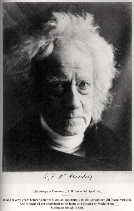
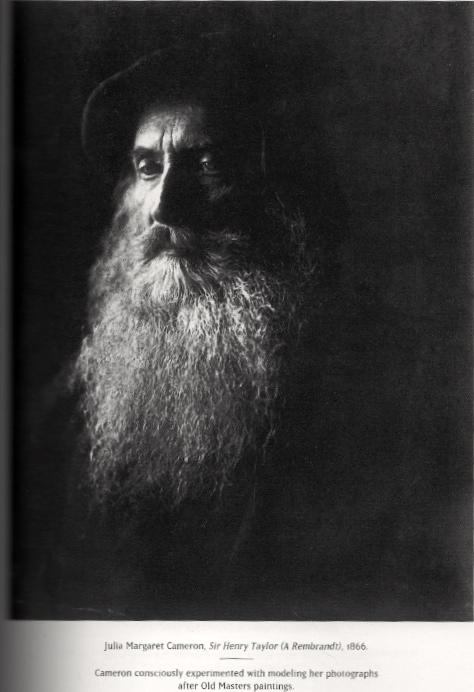
Julia Margaret Cameron - From Life
I took a book out of the library as i knew that Julia Margaret Cameron did a lot of really nice early portrait shots. The book was called 'From Life' however this was not what i expected it was a lot of words and only minimal images so i was only able to find a few nice portraits that i liked.
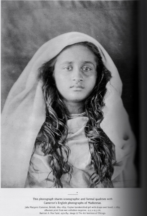
This image is the lightest out of the 3 that i have chosen from this book. I really like the way that the young girls face is framed by the white sari that she is wearing. She doesn't look as dark or creepy as the other two images. Gives a feel of innocence and purity. She doesn't however look very happy. Maybe this is because she had to stay still therefor had to keep a straight face?
What i like about this image is the way that the man appears from out of the shadows. Its really dark and has a kind of creepy feel to it. I like the way that you cant see where his body is its only his face in the light. There is really nice lighting hitting his face from the left hand side what highlights his features on the left side but isnt bright enough to highlight his body or most of the right side of his face.
Friday 23 November 2012
National Portrait Gallery - Queen Elizabeth
I was watching the news the other day and it showed a range of Andy Warhol images that he had created of the queen. It was part of a gallery she is putting on (or something) and it showed a few other image of the queen and i immediately thought that this would be good to put in research for my project.
 |
| Marcus Adams |
 |
| Yousuf Karsh |
 |
| Dorothy Wilding |
 |
| John Swannell |
This image looks as though the back ground has been lit separately and that the Queen is stood quite far away from the backing as she appears to be really bright and stand out in comparison to the background. Also looks like there is a spot light aimed at the back (maybe just behind the Queen) to create this glow around her. Also gives a kind of importance to it.
Terry Richardson
Something that i really like (what i didn't think i would) is the framing of the images below. I like the way that they are more to the right hand side of the frame and that there is a area of negative space to the left. This is because the image has been taken landscape were you would normally expect it to be portrait format.
 |
| Terry Richardson - Charlotte Free |
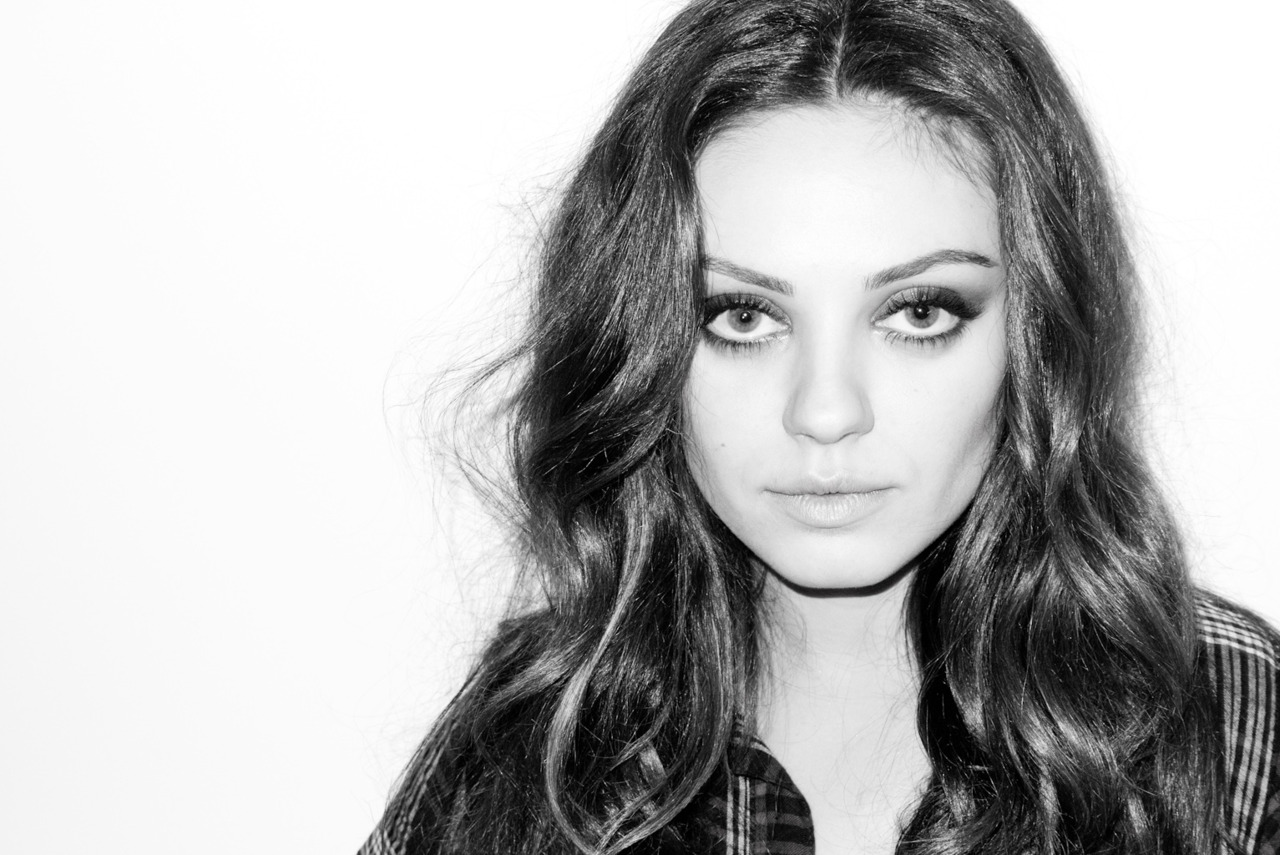 |
| Terry Richardson - Mila Kunis |

Shoot - 1
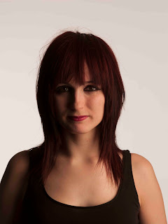
After today's session had finished during lunch i decided to do my first shoot using Rachel as a model. We used the studio one cove, with 2 strobe lights hitting the back drop with reflectors bouncing the light back onto the white background. Model stood in front of these reflectors with a soft box pointed at her from both the left and right (alternated during the shoot) I feel like the shoot was going smoothly and managed to get the camera focused right pretty much all of the time. However i forgot to do a test shot holding the card i would use late to add the right custom white balance. So below is an image from the shoot and then I'm going to go back and do the shot so i can get the right white balance.
I like the image. I think that it has been framed really nicely and i also really like the expression on the models face. However i feel like her skin tone just doesn't look right and also the back drop looks a bit gray so i think i need to go back to do the test shot to see if this will change these faults.


 |
| Image One |

1 2


3 4

5
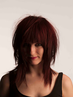
- As these were some of my first shots i wasn't expecting too much, just having a play around. Harsh shadows. model looks orange (what she clearly isn't) really like the colour of the backdrop and the lighting that's hitting that. Also nice catch lights in the eyes.
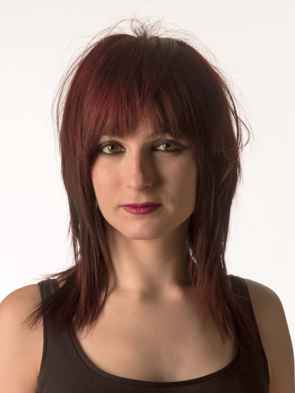
- I think that this is a really nice pose and i like how she is leaning towards the light with her hair scraped to the side. I think that the light is hitting her features better in this image. She looks rather girly.
- Only see one side of the face. I wouldn't want it for my images but kind of like it in this shot.
- Far too dark hardly see any detail in the models face.
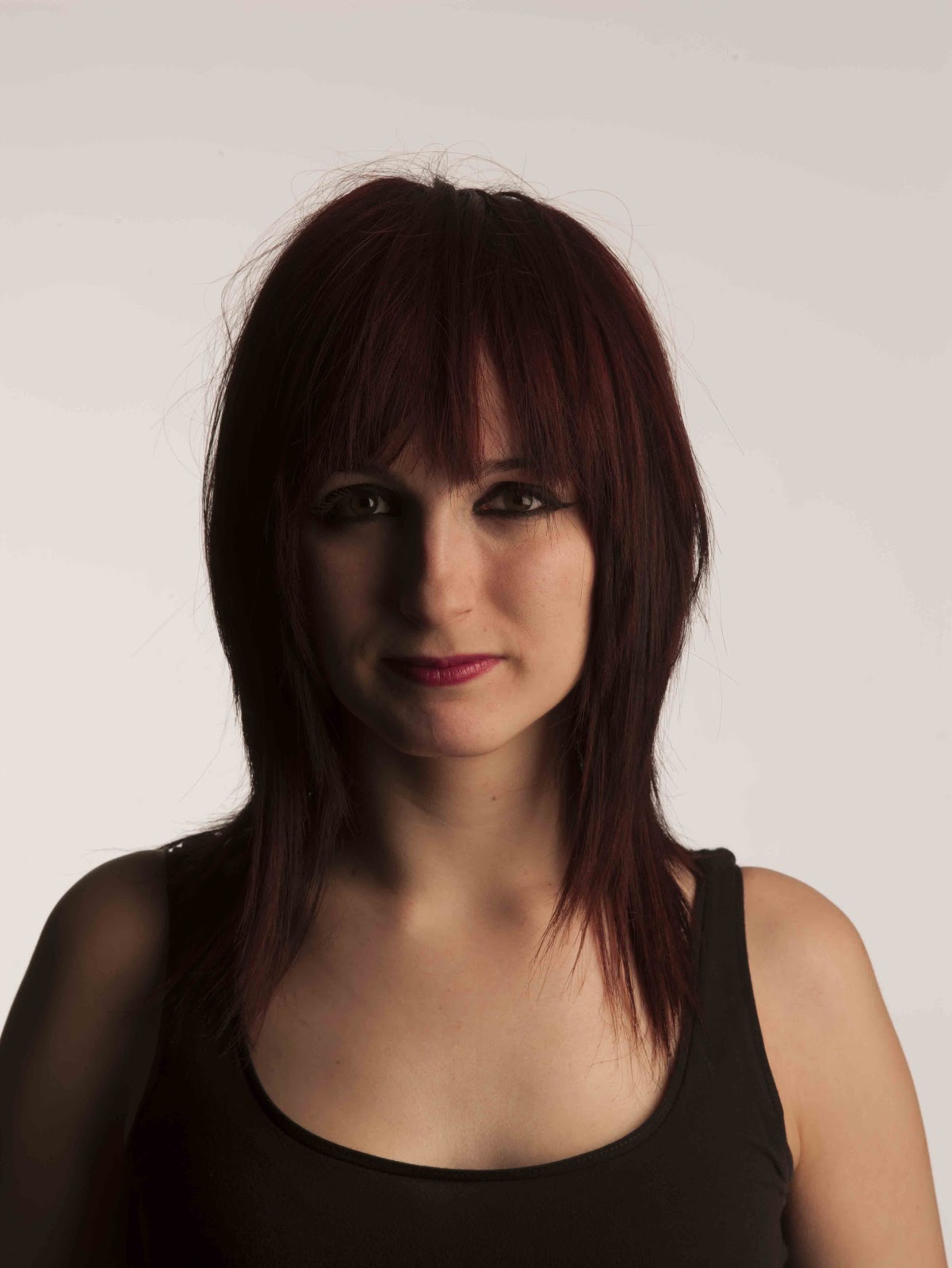
- I dont like the framing of the image. Too dark again. Background lighting is nice though. Like the models face and really nice light in her eyes.
David Bailey
....I have decided to re-post this post as it is relevant tot he work i am doing now....
There are a lot of these square medium format images from David Bailey called 'A Box of pin ups'. I decided to look at these 2 thought because it shows both a single image of one person and also a group.
 |
| Mick Jagger - David Bailey, 1964 |
 |
| The Rolling Stones - David Bailey |
I like the idea of a group portrait. I think it gives a little something different to the usual set up. I also really like the lighting in this image. How you kind of loose the detail on one side of the models faces because of the such harsh lighting coming from the left of the frame.
Saturday 17 November 2012
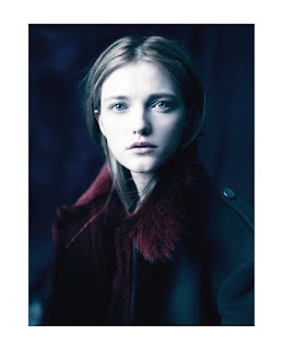
Paolo Roversi - Are all fashion? (mini rant)
would all of Paolo's work be classed as Fashion? I understand if there is over the top makeup and hair done, for example the one below..
But i just don't see how simple images that look un-styled and really quite natural cant be classed as a portrait? fair enough you could say the clothes she is wearing are being advertised but what do you expect her to wear?
 |
| The Shining Paolo Roversi |
But i just don't see how simple images that look un-styled and really quite natural cant be classed as a portrait? fair enough you could say the clothes she is wearing are being advertised but what do you expect her to wear?

I just cant get my head around this and I'm really finding it hard right now to get this project and what I'm meant to be looking for.
RAW Files
Just went on a website called 'understanding RAW files' and to be honest it couldn't have confused me more! Any way i decided to print screen and past on here. Maybe in a few weeks i can revisit it and have a better idea of what the hell it is saying... i just hope its right.
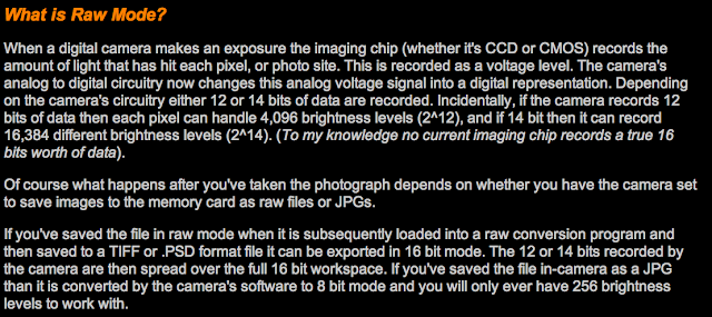

http://www.luminous-landscape.com/tutorials/understanding-series/u-raw-files.shtml
Old Work
This is an images that i have taken previously to do with portraiture. I wanted to add this into my research because i really like the detail in the image that you can see on my Grandads face. Shame you cant see his eyes clearly but seriously thats what he looks like all the time (hoping to god i don't end up loosing my eyes!!). i also like the darkness of the image, i think that this is because it was taken agains a stone wall so it wasn't white more a off cream. (taken outside with natural light)
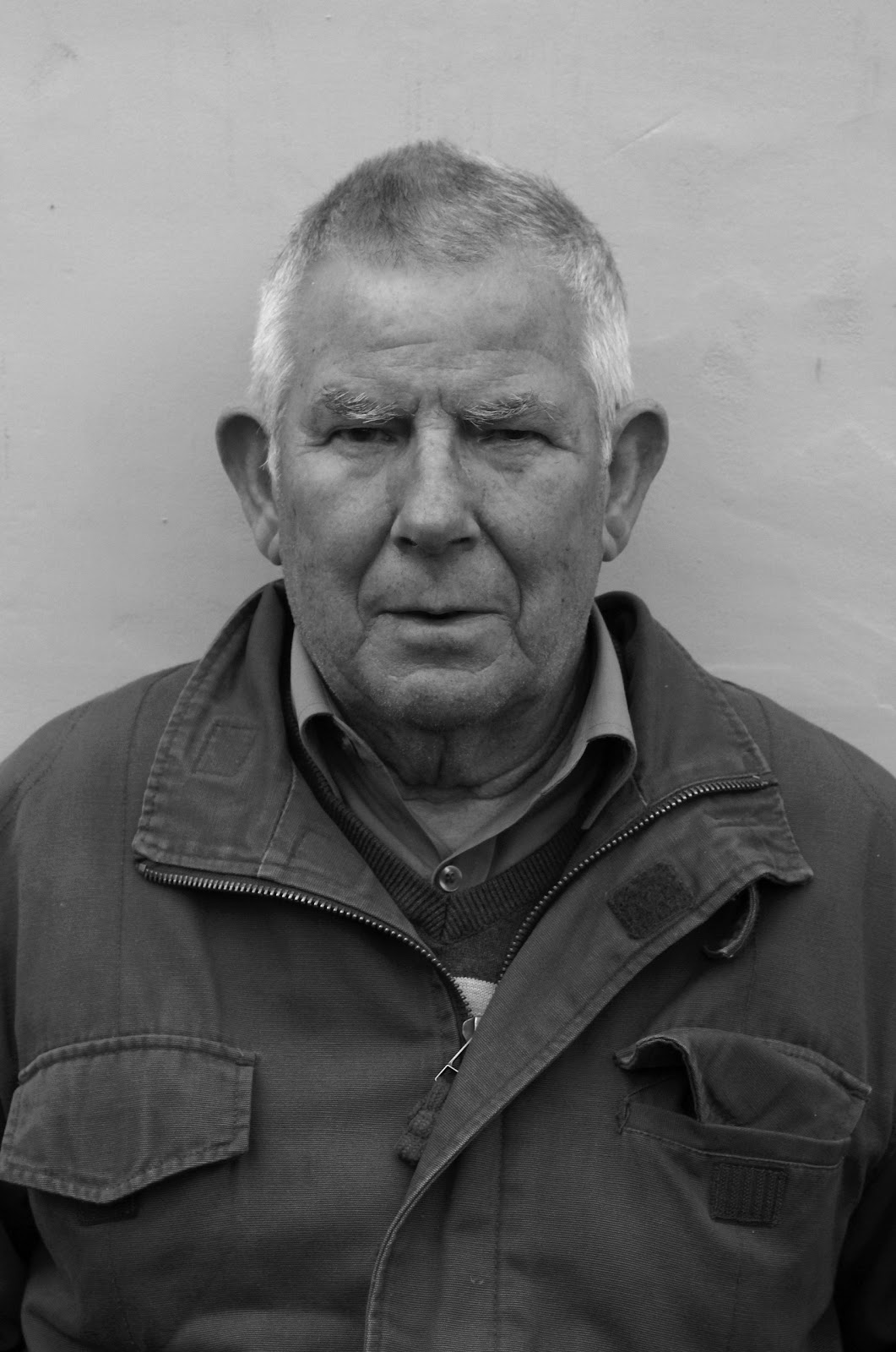 |
| Own image |
Richard Avedon
I think that Marilyn looks stunning in this image even with the kind of upset expression she has on her face. I really like the depth of field in the image, makes you really focus on her. I want this in my images so i am going to have to set the settings correctly for the depth of field to be as i want it. Also i really wish we were working in black and white for this project because i think it makes a portrait look so much more elegant and timeless, however i need to branch out more.
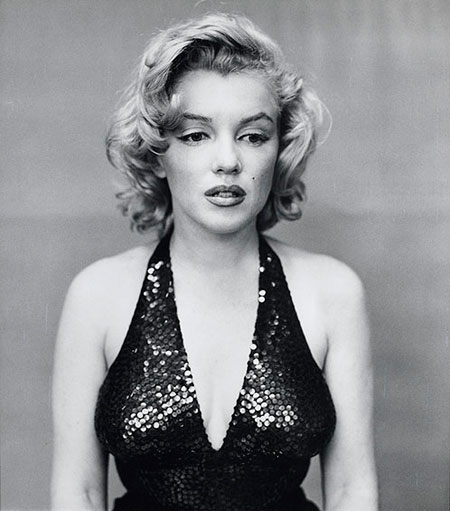 |
| Marilyn Monroe - Richard Avedon, New York 1957 |
Friday 16 November 2012
Irving Penn
''A good photograph is one that communivates a face, touches the heart and leaves the viewer a changed person for having seen it''
- Irving Penn
I decided that Irving Penn was a great starting point for my progect as it seems to me that his work is the ideal image of what a portrait should be. I dont think it can get confused with fashion or any other genra so its a safe place to being my research.  |
| Rudolf Nureyev - New York 1965 |
Here we go again
Well after yesturdays session im left sad and confused! I was totally looking forward to this progect yet now im left questioning what even is a portrait image? and has what i have been claming to be portraits up until now been totally wrong? Personally i thought portraits could spread across all genras of photography such as documentary, fashion and so on. Yet now im lead to beleive this is wrong.
Thursday 15 November 2012
Evaluation - Street Photography
When I started this project I thought that I was at an advantage to other people, as I knew how to process film and make prints in the darkroom. Then the more I thought about it the more it felt like the odds were stacking up against me. Street photography couldn’t have been a worse subject for me to do, and what use were dark room skills if I didn’t have any films to show them off.
When I initially started I was having trouble with blogger, as I’m used to sketchbook-based work and to be honest couldn’t even handle the thought of doing it digitally. However after beginning my research I found a way to use it to my advantage. I used all the time I would have normally spent making the pages of my sketchbook look ‘pretty’ were spent looking through books, scouring the internet and even watching music videos and dvds to find influence and ways to reference what I found into my work. After overcoming my initial problems with blogger and actually getting on to shooting film I hit my next issue. I couldn’t bring myself to go onto the street and take ‘street photography’ images. I feel that it took me a while and a good few rolls of film to warm up and get used to what I was doing, I feel like this is shown through the first few contacts that I produced. Also it took this time to find the confidence to get up close and personal with people on the street. This is what I think were my biggest weaknesses throughout the project however I think that I overcame these and produced a blog and also a set of images that I am happy with and am able to present as a final piece.
When developing my films and also working in the dark room, I felt comfortable and this is were I could see my project taking form and finally having some images I could actually call street photography images. I also learned a lot of new skills in the dark room such as adding contrast and split toning images. I also brushed up on skills I learned in college such as developing images by hand as well as using the machine to process them. I think this is an area that showed my strengths during this project and what I feel I was most successful at. Another aspect I feel I showed strength through out in is my research. I tried to get a large amount of research that varied over different media so that I had the best possible foundation to create my project on. I looked at artist such as Markus Hartel, Danny Santos and Michael Levine who I feel were great influences in my work and whos work I really appreciated and wanted to be influence by. I also looked at films such as I Am Legend and a range of different books that give me a varied input to what influence my work.
If I was to do the project again I think I would try and just get over my fears of getting out onto the street and taking photographs. I would have also liked to visit a wider range of locations to capture my images as I think that this would have helped show variation. I would have explored different avenues and followed some ideas that I had into more depth.
Overall though I feel like I’ve learned a lot during this project about how to tackle and handle situations as a photographer and also simple things like what we are actually allowed to do and what our rights are. I am really happy with the outcome of my project and I feel that it answers the brief accordingly.
Final Images
It took me a while to actually choose my final images as i had a lot with people in and the rest were basically just empty streets. At first i was struggling to find some type of link to connect all my images, but then i took Darren's advice and decided that the like was me! So i just picked the images that i was most proud of and what i thought were a good enough standard. I then came up with a link between my images. They all had people in the society kind of looks down upon or sort of disregards. I chose a smoker, a hoodie, a traffic warden, a beggar and also an old lady. I'm not sure if we needed a link but i figured this was a good enough one if we did.
These are my final images:


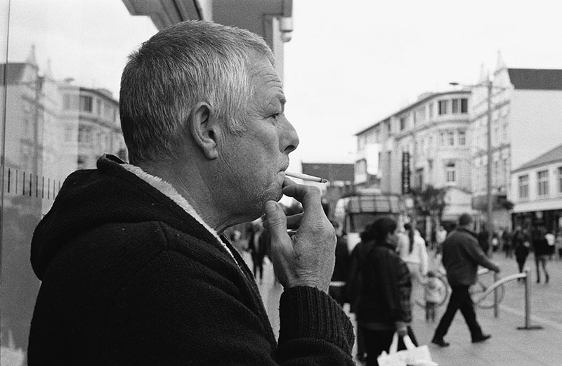
What i really liked about this image was the depth of field. I liked that the man is the only one in focus. you can see that there is a busy town in the background yet they arnt the main aspect that you focus on and i think this is because of the shallow depth of field. I also like all the detail that you can see on him. For example the smoke coming out the fag and the lines and marks on his face. I struggled a bit in the darkroom getting the skyline right and with my burning in skills, however after the many attempts i think i got a really nice print. Its also one of the closest shots i managed to get so I'm really proud of myself for it.
These are my final images:

I chose this image because i think that it is a contrast to my other final images. I feel like this has a lot more going on and detail in it. It has more for you to look at and work out. I also like that the main subject is facing away from the camera. this also gives another angle and dynamic to my final images as a hole. I think that there is a great contrast in tones what i think makes the image a strong and interesting image. I also think that this is nice because you can see everything in the image clearly, there isn't a shallow depth of field or an object/subject taking the main focus.

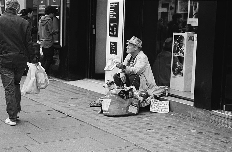
Again i like the contrast in this image. I think that even though its kind of simple it has a lot of detail around the man himself and i think that if there was more going on in the outer areas of the frame this detail could get lost in the image so i really like the fact that it is cropped into. I even like the man in the left hand side of the image even though he's slightly out of frame. i think that this gives you an understanding of how people treat people like this, this is shown by the way he is looking down on him and how the man on the floor is pointing the sing at him. I'm just glad i got this shot when i did and not one of him looking at me. I also like how the dog is even looking at he man walking past, its like there both trying to guilt trip him.

This was the last image i chose as part of my set. I decided to choose it because i think that it work well with the rest of my images. I like the composition of the image, its like the bench leads your eye across to the lady. I also really like the contrast and tones created by the Lady's jacket and i think that this is something that creates a lot of detail in the image. Another thing i like about this image is the poppy sellers that you can see in the background. It makes the town look busy and also its not something that you see all the time. Really helps to define the time of the image knowing that this is around remembrance day.

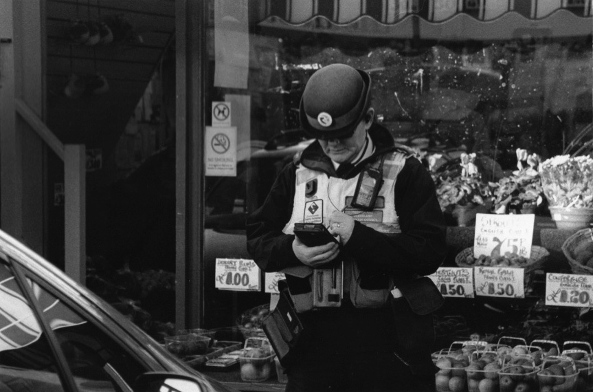
This image is one of my most proudest. I just didn't think that i was going to take it because i was really worried if she caught me but I'm really glad that i did. I really like the reflection of the shop in the car window, and also the light reflecting of the car itself. I also like the detail created by the fruit in the background. I did have a bit of trouble with this image when scanning my negative in as when it came to spot checking it i wasn't too sure what was dust on my neg or what was the muck in the widow behind the lady. I also like the contrast in the image. however in my final print i did crop into it a bit more so that you could see the traffic warden more clearly. Over all I'm really happy with this image and I'm so glad that it came out and actually was correct in all the settings when shot.
Comparisons - Richard Sandler VS Me
I have just realised how one of my final images has been strongly influenced by an image that i researched right at the beginning of this project. I think that it has some of the same qualities that this Richard Sandler image has.
 |
| Richard Sandler |
 |
| My images |
I think that these are both similar in the way that the homeless men are both sat on the floor and looking at the people walking past and not in the direction of the photographer. Also the subjects in the image are on the floor and its almost like the people walking past are looking down on them, maybe because socially they are better than them or because they pity them. I think that now i have put these images together you can see a clear resemblance and influence in my work by Richard Sandler. Even though when i was taking this image i wasn't really thinking about influence, maybe it was subconscious?
Drop Box
Was anyone else having trouble finding the dropbox today? Mine wasn't at the bottom bar thingy... slightly worried.
Wednesday 14 November 2012
Reservations
At the beginning of this project i was gutted to find out that we wouldn't be making sketchbooks and thought that was me over with. However i feel like giving Antony around of applause for making my life a hell of a lot easier. God knows were my head would be at right now if i was having to cut, stick and write about everything that i wanted to! i would be no were near as far as i am and defiantly not have done the research i have.
Comparisons - Markus Hartel VS Me
Another theme i kind of wish i explored more was maybe looking at billboards and were they are on the street and depending were they are to what the advertise. These are two of my images that i took during this project. i think that it billboards really add a lot of detail to an image and can make what could be a boring image more interesting (image 1) or give an indication to the location of the image (image 2) for example you wouldn't put adverts for a sofa in the middle of Camden or a vice versa.
 |
| Image 1 |
 |
| Image 2 |
Markus Hartel:
See i think that the billboards above the people in this image are what really make it. It gets boring looking at images like this with normal sky or plain buildings in the background. However this adds detail to the image. I just like it when they have images within an image it adds more dynamic to the image and also more contrast. Gives it also a busy feel. When he has captured the image however he makes them blend in as part of the image not like its what the image has been taken for.

Brick Wall
All the pressure of knowing deadline is fast approaching is really giving me mind block. I actually don't know what else to put into my blog! like can you still add research after you have finished shooting? or is that pointless. Maybe should have planned my blog layout a bit better, glad I'm not having to cram though i think i would die from the stress of it.
Comparison's - Guillaume Gaudet VS Me


I found these images on google images when i was wanting to experiment with reflections in my street photography project. This is were i got the inspiration for the image i shot in shoot 9. i liked these ones in particular because you cant see the tops of the buildings, they are showing in the details in the puddles, again this is very similar to mine.

This is the image i shot in Middlesborough town centre. I think that you can see the clear resemblance between the images and can see clearly the strong influence the photographer had on this image. Unfortunately i didn't have a nice of a location as he did. I do like these images though and i think that if i had the time again this would be the angle that i would defiantly explore in more depth.
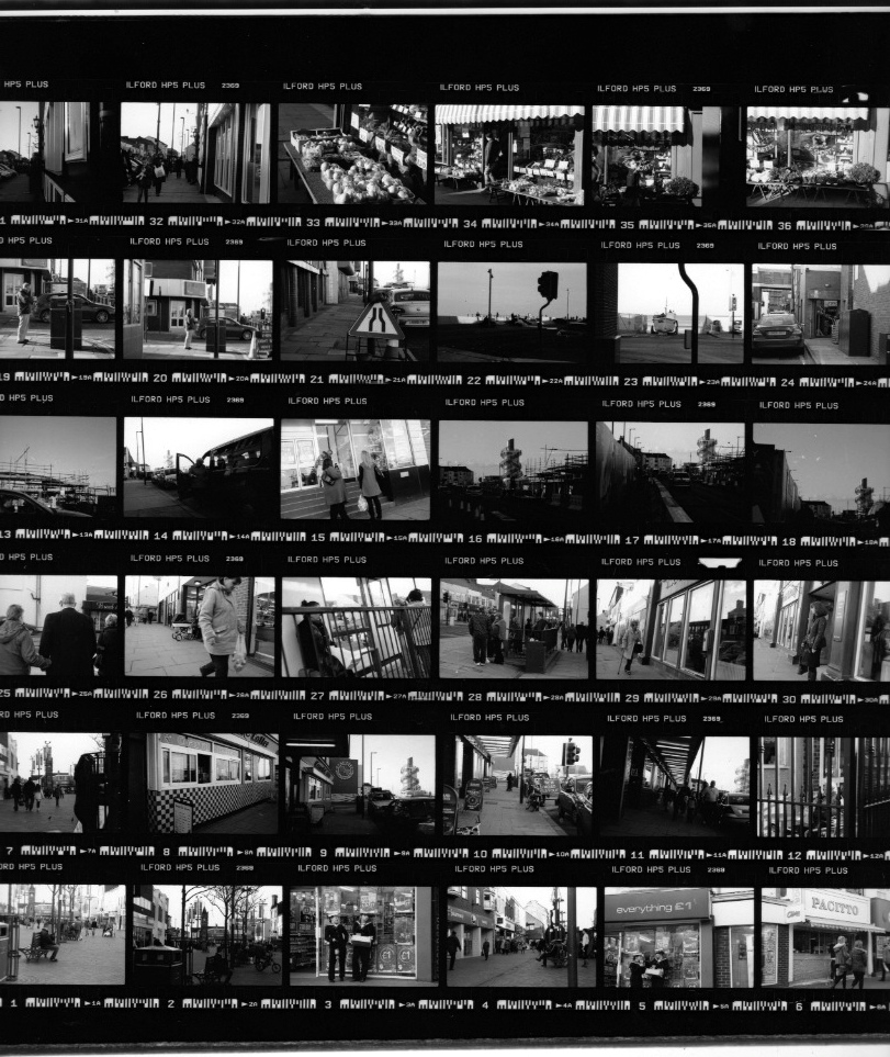
Contact Sheet - 12
The out come of the 2nd roll of film shot at Redcar. This is my favourite of the two as i think that i got some really nice up-close shots and felt more comfortable shooting. Again same with the last one some of these images are a bit too dark and loose a lot of detail. However i think that there are a lot of nice ones so I'm not too bothered.

Enlargements:

this is one of my favourite images. I like that there is a lot of people in the background yet you focus mainly on her. she really stands out and i think she pops off the page. i like the contrast in the image. When creating this as one of my final prints however i will be sure to make sure that i don't loose detail in the blacks and that my whites are white not gray. Maybe add more contrast.
I'm so excited about this picture! because of all the trouble Ive been told from people taking pictures of police etc i was in two minds if or not to take this picture. (i know shes not the police but i recon shes a right bitch) but anyway i got into my mams car and as she pulled out the space i begged her to stop and i just took it, least i knew i could make a quick getaway. Looks like the neg is really mucky and scratched in the top right corner however this is just the window of the fruit and veg shop (seriously should wash them as it isn't very inviting is it). Also like how you can see a bit of the car so you know what she is doing.
Contact Sheet - 11
This was the first roll of film that i shot on my 2nd trip to Redcar. I'm so happy that these have turned out and that there is some really nice shots on here. The weather was a bit dark and damp so that's why some are really dark. I didn't change my settings correctly, and i didn't want to use a flash gun.
Enlargements:

i actually sat on a bench for ages just to get this image, building courage up to actually put my camera to my face and take the shot. The girls didn't really look the nicest of people. However I'm really glad that i did. I like the image and i think that its something you can only really get every so often its not a picture that you can take all the time. I also like all the posters in the background (shop window) as i feel it adds detail to the image.

If i would have just stopped walking and maybe got a little bit closer to the man i think that this would have been one of my favourite images. You should have seen the man eating the fish and chips, think he was scared someone was going to take them off him! Its nice how he is stood in the light coming from the gap in the buildings. Think that this highlights him and stops him from getting lost in the image.
Screen Shots
I have looked through some movies that i think have a great setting and make up a great image when print screened. I think that this is a great way to gather research as you can get a variety of different print screens, not just a single shot. You also can see why the director has chose that space, what feel it gives and what makes it unique to any other.
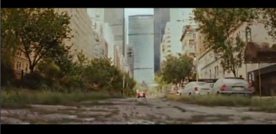
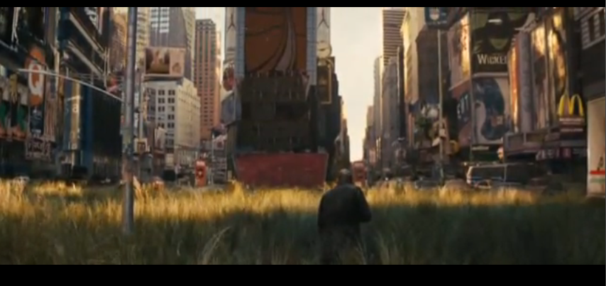
I Am Legend -
I think that its amazing that I Am Legend managed to shut down time square to film these scenes. Its such a busy place and yet its so quiet and looks like another world in the screen grabs below! i think that these are seriously stunning images and some that could never be recreated, unless you have millions of dollars and Will Smith as a mate... completely unique street photography.


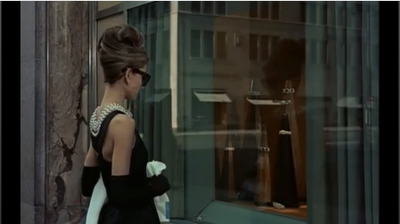
Breakfast at Tiffany's -
Iconic images from a great film. again showing new york empty and quite what is a rare thing. really like the lighting created on these images from the sun coming up. soft tones.


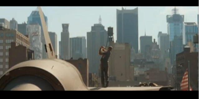
Lords of Dogtown -
By far my favourite film. i think that these screen grabs remind me of the images that i have researched by Michael Levine.

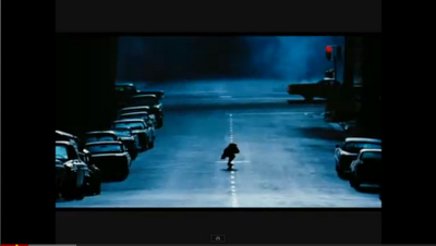


I Am Legend -
I think that its amazing that I Am Legend managed to shut down time square to film these scenes. Its such a busy place and yet its so quiet and looks like another world in the screen grabs below! i think that these are seriously stunning images and some that could never be recreated, unless you have millions of dollars and Will Smith as a mate... completely unique street photography.


Breakfast at Tiffany's -
Iconic images from a great film. again showing new york empty and quite what is a rare thing. really like the lighting created on these images from the sun coming up. soft tones.


Lords of Dogtown -
By far my favourite film. i think that these screen grabs remind me of the images that i have researched by Michael Levine.


I think that all these screen shots from movies would work really well as street photography shots. They are shot in some of the best locations and also some cant be re-created so there completely original. This is why i think that movies are a great source of research.
Subscribe to:
Posts (Atom)