Thursday 30 January 2014

New Progect...

I am really looking forward to getting into this project and really seeing were I can take it. I think that this is a refreshing break, even though I love portraiture work, it’s nice to be doing something else for a bit. And I think that it’s perfect timing to do so!

I really feel like I let myself down in the last project so I am really going to keep on top of my blog work. I really don’t want to get in the same position as last time.

At first glance of the brief I think that I am going to go down the ‘journey’ route and see what I can create. I am going to have a good think though before I truly set on a theme. For now research on books and layouts will be my starting point.

Friday 17 January 2014

Overall Evaluation

Since the beginning of the year we have been undergoing the workshop project. This consisted of several mini projects under one brief. The aim being to explore new techniques and create new skills, overall producing an outcome for each one.

At the beginning of the project when we were given our brief I was excited to get back to work and get my teeth into something I could really work on. This enthusiasm lasted not long at all. This was the biggest disappointment and I feel like I really let myself down. I just didn't have the motivation I had in the beginning and found it really hard to get back on track through the project because of it. It wasn't until I got to my self-directed project that I really got this enthusiasm and drive back. I feel like this may have been too little too late. Areas like darkroom and also my blog had suffered because of my laziness and there is no one to blame but myself.

Surprisingly the areas that I have avoided in the past due to not enjoying them are the ones that have thrived in this project. Digital has never really been an interest of mine but this project has changed that. I found my fill flash and my self-directed project to be challenging but in a constructive way, overall being enjoyable and the time when I was most engaged in my work.

To do this time over I would have found areas that got me motivated and back on track. I love to blog and it’s a shame that this was affected by my motivation. If maybe I would have put some effort in and found artist work that got me fired up and ready to work this would have made my time be more well spent and possibly got more outcomes for the medium format work like I wanted to.


Even though I lacked motivation I’m so happy with all the outcomes for this project and think that each and every one responds to the brief strongly and is clear to see. 

Evaluation - Learner Agreement

Something I have always struggled with in photography is writing my own self-directed project. I don’t know why I have this problem as I have loads of inspiration that gives me great ideas for projects all the time. However when it comes to having to write one I never seem to be able to pull it off. I’m pleasantly surprised that this wasn't the case in this project. It may have took me a day or two to come to an actually definitive topic, but there was ideas flowing constantly.


Getting my project off the ground also seemed to be far too easy if you ask me. I had a group of models who were willing to have the pictures taken and seemed to be available whenever I needed them. This was a huge relief as it was a project based on having a different model for each shot. It wouldn't have worked as well if I only had a select few models. 

Research was one of the main components in this project and it really backed up my idea and influence it greatly. Artist such as Thomas Ruff and Corrine Day were the biggest influence to my work and I think that this is clear to see. These give my work more meaning and showed me different ways that photographers have basically approached the same kind of work.

If I was to re-visit my project I would maybe give myself more time for the later shoots I have produced. I feel like the pressure got to me and caused me to rush. I don’t think that is to visible apart from in the last shoot. I managed to amend this the best I could using light room and think I have been able to get it to a standard where it will stand next to the other images without being too noticeable and stand out too much.

Overall I’m extremely happy with how I have approached this project and also the outcome with it. I am surprised how smoothly everything ran and I think this shows in my final print as I have been able to spend time on it and not have to rush. 

Evaluation - Medium Format

This wasn't the first time that I had experience using medium format black and white film so it meant that I knew my way around the camera and I felt pretty confident when shooting and processing the film.  This being said I did run into some slight problems what turned out to be nothing more that careless mistakes on my part.

I feel a little let down with myself when it comes to this project because I like to finish things that I start. But I feel due to an ambitious self-directed project it didn't leave time to come back and revisit the medium format work. this is a shame as I think that with more time and a better direction to take my work I could have produced some really nice prints as in the black and white darkroom is where I feel most at home. 

Another reason I feel I let myself down in this project is that there are so many amazing photographers who produce medium format work out there and I feel I didn't even scratch the surface with research. This is again something that I could have delved deeper into with time.

Overall I think that I produced an adequate amount of work for this project considering it got abandoned not long after getting started. This being said I would have still liked to have produced the 9 final prints as a personal goal as I like to complete what I start. 

Medium Format - Shoot 3

This is the last shoot that I managed to get done before I realized that it was probably best to abandon the project to make sure that I would have time to really explore the self-directed project. I made sure that I used all the lens in this shoot so that I had experience with them all:
Reece – 50mm
Zeba – 80mm
Matty – 150mm


Enlargements:


I am really happy with the outcome of this shoot as I think that there are some really strong images that show my skills and I think that this is a high that I can leave the project on. If I have time I would really like to come back to this to revisit and shoot some more medium format work. 

Book Research - The Great Life Photographers

I know that these shots aren't medium format work but the reason I put them in is because I don’t think that its important what format the photographs are for them to be inspiring and give my tips and ideas that I can use in my medium format work. 
Robert Capa:

What I like about this image is the grit and grain of the image. This is what I like about film photography, it gives the image a rustic feel and real gives the image a quality that you can’t get in digital without a lot of editing. 


Andreas Feininger:

I would really like to know how the photographer has managed to get the lighting like this in this shot. I really don’t understand it but I really like it. I also like the detail how you can see the aperture in the lens of the camera that the model is holding up. 
Philippe Halsman:

I’m obsessed with portraits of old Hollywood a listers in this style. I wish I could simply touch upon the look and quality of images such as this one. They hold such grace!

Medium Format - Shoot 2

When I was discussing shooting my last roll of film with Tim and how the light meter told me how to correctly expose the shot but when they came out the light was too harsh and this was not what I wanted he give me some helpful advice. As you only get 12 shots with the medium format it could get really expensive if it keeps going wrong. He told me to take the digital back for the Hasselblad with me to the studio, set my lighting up and shoot using the digital back. The reason for this was to get the lighting and the expose right before I used the roll of film. This was such a good idea as all my images on the film came out exactly how I wanted and the lighting was perfect for the look I was going for. 


The lighting I had was one light facing the model using a soft box so that it subtly lit her face. But I also had a light behind the model aimed at the back of her head. The reason for this was to hopefully get the “old Hollywood” glow like famous film stars had in the day! I’m glad I chose to do this as in the past Rachel’s jet black hair got lost in the background. This way it stands out and you can see were her hair ends and the background begins.

Enlargements: 


Final Image - Learner Agreement

The aim of this area of the workshops was to write my own learner agreed project and then carry it out. This is the outcome from that project proposal.  

I’m extremely proud of how this has turned out. I had an idea in my head of what I wanted my final image to look like but I think it has out done my expectations. I’m really happy with how the colours have all really worked together and how they have highlighted and extenuated the model, there hair and also there style. This is really different to the portrait work I have produced before as I stepped out of my comfort zone and used really bold and rather a lot of colours. I’m so glad that I explored different ways of working as I am really thrilled with the outcome of this. 

Final Image - Fill Flash

 The object of this workshop was to eventually produce a 20 x 24 digital C-TYPE print using fill flash.

Although I was really not looking forward to this project, and in struggled a lot throughout it I think that this is the proudest I have been with a final image because of this. I might be sounding big headed but I think that I have produced a picture that satisfies the object of the brief I was given but also satisfies my own personal taste when it comes to this style of photography. Because of these reasons I am so proud of myself and of my final print. 

Research - KR


"KR - an emerging young voice out of the West (Los Angeles, California to be exact)."

I seen an image of BeyoncĂ© (anything BeyoncĂ© related and I’m there) after I posted something onto Google+. So I clicked on the page and looked through some of the images when I came across this photograph by a new music artist. I like this because it is a medium format set up and I think that this is the style of image that I am more likely to create rather than the ones I have seen of the likes of Steve Pyke. It has an urban, hip feel to it but still the classic style that I think my brief is wanting. I like the grain of the image and the gritty feel it has. I’m not sure if this image has been shot on film (my personal opinion it might be an instagram spesh) but I still like this quality.What I also like about this is the dark tones. The image is really gray. Normally I think that this is a bad thing and that you need harsh whites if an image is this colour to lighten it up, however in this occasion I think that without these whites the image is subtle and quietly oozes class and power.

Framing Final Image

Framing my final images turned out to be an extreme stress! I literally had to sit with my face so close to the screen that it hurt just so I could count all the little notches to make sure that the sizing was perfect. 


When setting up my image I made it so that the canvas size was 2inch smaller on the width and that it was 2.4inchs shorter on the height. The reason that I did this was so that I could place the image right at the end of the canvas. This seemed to make it easier for me. I worked out the sizes and the size of the gaps using a calculator. This was a carry on but I eventually got there. When I had placed my images I simply went to: IMAGE>CANVAS SIZE, then I added what I took away back to the sizing of the image. This created my boarders around the image. 


This shows where I changed the size of the canvas. It was really straight forward and I think that it was easier this way as I knew my boarder around the image will be exactly the sizing that I wanted. 


Colour Portraits - Shoot 9

Sooo I may have spoken too soon. Everything seemed to be going so well until it got to this shoot. I was against the clock with this one as the model was reluctant to get her photo taken I had to beg her and she literally would only let me shoot for 2 minutes as she was busy with her own work. This is understandable as she did have stuff to do and I appreciate her help but the pressure caused by having only a small period of time was terrible. I decided to try and get the light set up ready for her getting there so I used Rachel to help this saved some time but not much. 


I had the same problem when shooting this model as I did when I was doing the shoot with Melissa. She wasn't familiar with the studio and she didn't feel comfortable with it and this is so clear to see in the models body language and facial expression. This as well as the pressure from the minimal time I had caused me really to stress and panic. 

Enlargements:

If there was anything that I would be disappointed with during this project it would be this shoot. I feel like everything had gone so smoothly up until this point that I didn't expect out to go wrong at this point. If I had the time I would have gone with a different model to re-shoot the last image but time was slipping away and I needed to give myself enough time to frame my final images as one and also get it sent off to print. 


Because of my panic and rushing the shoot, what I k now have learned should never be done, I forgot to use the reflector to bounce light into the image and get rid of the shadows on the image. I am so angry with myself about this. So far I haven’t had to edit any of my images but I think that this is going to take some work to try and lighten up. Hopefully I can get it to a standard that I am happy with. I am really unsure as to what image I am going to choose for my final one. I am going to have to take the best I can and tweak it to get it to fit in. this again is through no fault of the models just my panic and forgetfulness. 

Colour Portraits - Shoot 8

I have been really lucky and have managed to get my shoots set up and running straight away. This has been such a help as it makes it easier to get in get the shot that I am looking for and then move onto the next model. This isn't my favorite way of working I normally like to spend time experimenting and playing with the models pose, expression and styling. But none of that is really applicable in this project. I have a set style and a set format to the image that I only want to slightly change with each model so it really seems pointless to experiment when I know exactly what I want. I feel it would be a massive waist of the little time that I have.


This turquoise blue is really the perfect choice for Harriett because the blonde hair stands off the background better than any other shot I've done. I think that maybe this is because she is blonde and the light really illuminates her hair and gives it a lovely shine. She looks like a mermaid (my favorite thing and aim of my life to look like one)

Enlargements:


The natural nature of this image instantly makes it more appealing to me. I would love to put this image as my final image as I think it’s beautiful and the model really looks like she’s happy and it’s not posed. The unfortunate thing is at this stage and looking at the images that I have already chosen to possibly be my finals they all have really relaxed expressions and I feel like this would stand out too much. I don’t want any one image to stand out more than others and I think that this would be the case if I was to choose this image.


I think that this is only the second time I have actually shot an image of a model that is wearing glasses and the first in the studio. I found this really difficult not to get the flash caught in her glasses. You can see that in this image unfortunately I have. This has also happened in the image above. I also don’t like this image because the fact that the model is looking up you don’t see as much of her eyes because of the glasses and also the shadows created by them

Final Image:

I chose this because I think that it is a strong image and also it’s like the first image I spoke about but it has a softer more friendly expression on the models face what I prefer.

Colour Portraits - Shoot 7

Seventh shoot and back to shooting fellow photographers! I didn't realize before but this really does make it easier. They understand what you are doing, are familiar with the equipment and really help make the job of getting the shot easier. Purple was a great choice for the background for Emily as the deep green colour of her shirt really works well with the colour. This was a very easy shoot and I was lucky to get an image that I was happy with rather quickly. This was the ideal scenario as I was struggling for time. 


Even though the framing of this image is slightly off I think that this is one of the best images from the shoot. I could maybe crop into it slightly to even it out. I like the slight smile in the models face, it resembles that of the one I shot of Charly previously. I also like the rich vibrant colours created when the light hits the models top and also the background. I could have maybe done with directing a bit more light onto the right hand side of the models face but I picked up on this and moved the reflector board closer to the model.  


One of the main problems I have come across during this experience is my ability to communicate with the model and tell them when to be ready. This is something that I really need to work on as I have numerous amounts of images like this through no fault of the model. This is really frustrating because I have some amazing images that I am unable to use due to my communication skills.


Unlike other images of this nature this one has worked rather well lighting wise. Often when the model has looked away from the light it has created harsh shadows on the face. However I think that this one the lighting is surprisingly soft. Maybe this is because of the reflector used and moved closer to the model to try and bounce light into the shadows in the face. this would have been a perfect final image for my collection but I don’t like the way that the models body is turned as this is something I have aimed to stop (again due to my bad directional skills I haven’t been able to avoid it) and also I don’t like the way that the model has raised her eyebrows causing lines on her forehead, this is something I didn't realize at the time only after the shoot. 

Framing Research

Framing is just as important in this project as the images themselves. Below are some great examples of how I want my final image to look. I think that as well as making an extremely strong image over all when it is composed of several smaller strong images, I also think that these compositions make for interesting images. Pictures like this make you stop and look longer at the image and really take interest and examine each individual detail in the picture. And that’s the aim right? I want people to stop and take a longer look and an interest in my work. 


There is a variation in how many images have been displayed on the page. For my work I have decided that I want to place 9 images on the page. It will be composed in 3 rows of 3. The reason being for this is that I managed to get 9 different models shot. I think that this is also a really nice format. I did have a little spare time to shoot more models but only the odd few. If I was to shoot more models I would want to do another 7 models this would make 16 images creating a 4x4 format. I don’t think that I would have had the time to do this and also I would have felt I would have to rush the images. This would affect the quality of the image and I don’t think it would have been worth it. I would rather focus getting the best images I can with the few models I had


This shows the format that I have decided to go with when framing my images. This was the inspiration for my project and I am glad to see that it hasn't changed along the way. 

Artist Research - Stevie and Mada

I came across these when I was looking for research on examples of how I want my models to be posed and also the expression. I began to look at some of the other work and I found some really strong portrait shots that create impact. All of the models have presents in the image, they are really engaged and connecting with the camera creating a stronger image. This is a really important attribute that I want for my images.  


This has so much attitude! I think the reason for this is mainly the styling of the model. It’s really interesting just how much styling can effect an image and really give it character. This is one of the points that I am trying to show. People’s style makes an impact on other people and shows you how they are perceived. The model has being portrayed in a “hood” style. The strong makeup and hair is the main aspect of the image. However the lighting also is quite harsh and dramatizes the models features. The way that one side of her face is really bright compared to the other, what has harsh shadows. The strongest part of the image has to be the eyes they make such a connection and the small subtle catch lights draw you in like prey, not jump out they suck you in!


This is the most angelic looking image of the 3 and this is relevant because I feel some of the image I have shot so far also hold this quality. The lighting in the image looks natural but I think that it’s been cleverly set up in the studio to appear this way. The gray shades and the lightness of the models hair and skin give the image a cold feel (unlike the one below what has a golden warm feel to it) I like this as I think that it compliments her and the styling. The composition of the model and pose is very similar to the image above and this just proves that aspects such as styling can really effect the feel of an image. As this one is angelic whereas the above is full of attitude. 

I have left this till last because this is by far my favorite image from the ones that I have looked at. It’s just so strong and has such power yet the model still looks girly and flirty. I think that this image embodies feminine style and look but still shows independence and power. She is stunning and her make up really adds a feminine touch. The models old Hollywood look is complimented by the soft lighting that brightens her whole face. The pale complexion makes the bold red lipstick really pop in the image. I like the framing as the models face is center and her piercing eyes really draw you in and capture your view. There looks to be light hitting the models hair from the black/side this also adds to the classy old Hollywood look that the image has got. The colour in the image really blend well together, the colour of the models hair and the jumper and background is a great attribute, it works to give the model a golden glow.

Colour Portraits - Shoot 6

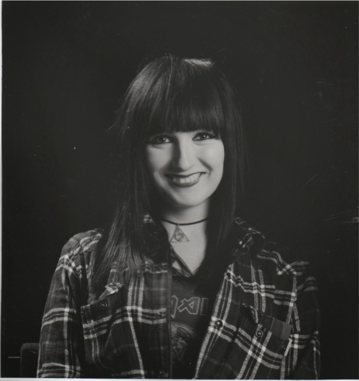
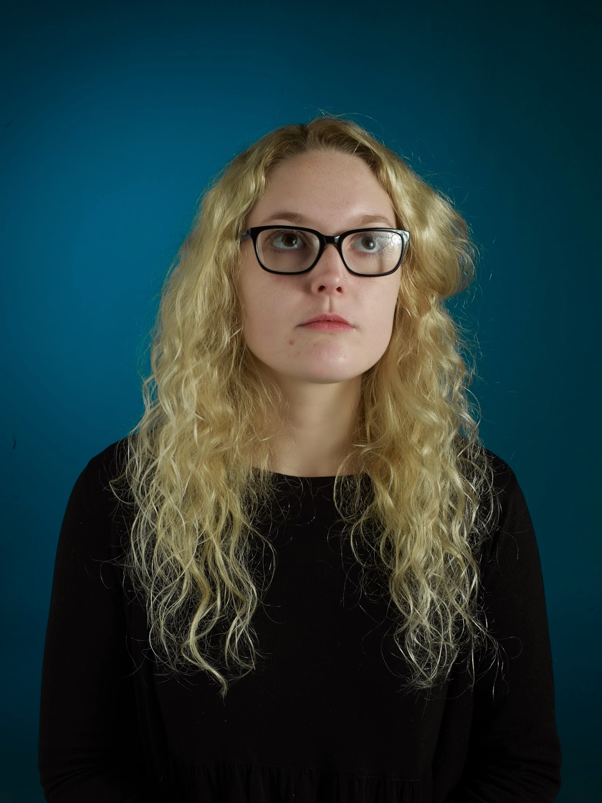
After shooting Chloe I went straight on to Charly. This was really helpful because all the lighting was set up ready and I had lots of people who were able to help me with such things as reflectors. I also was able to explore more expressions in this shoot to and try and get the best out of Charly as I felt like she was comfortable and happy to get her photo taken. This is really helpful as because she was relaxed it made me feel relaxed and I felt like I could ask her to do more without feeling like she didn't feel comfortable. I think that this is really reflected in her facial expression. 


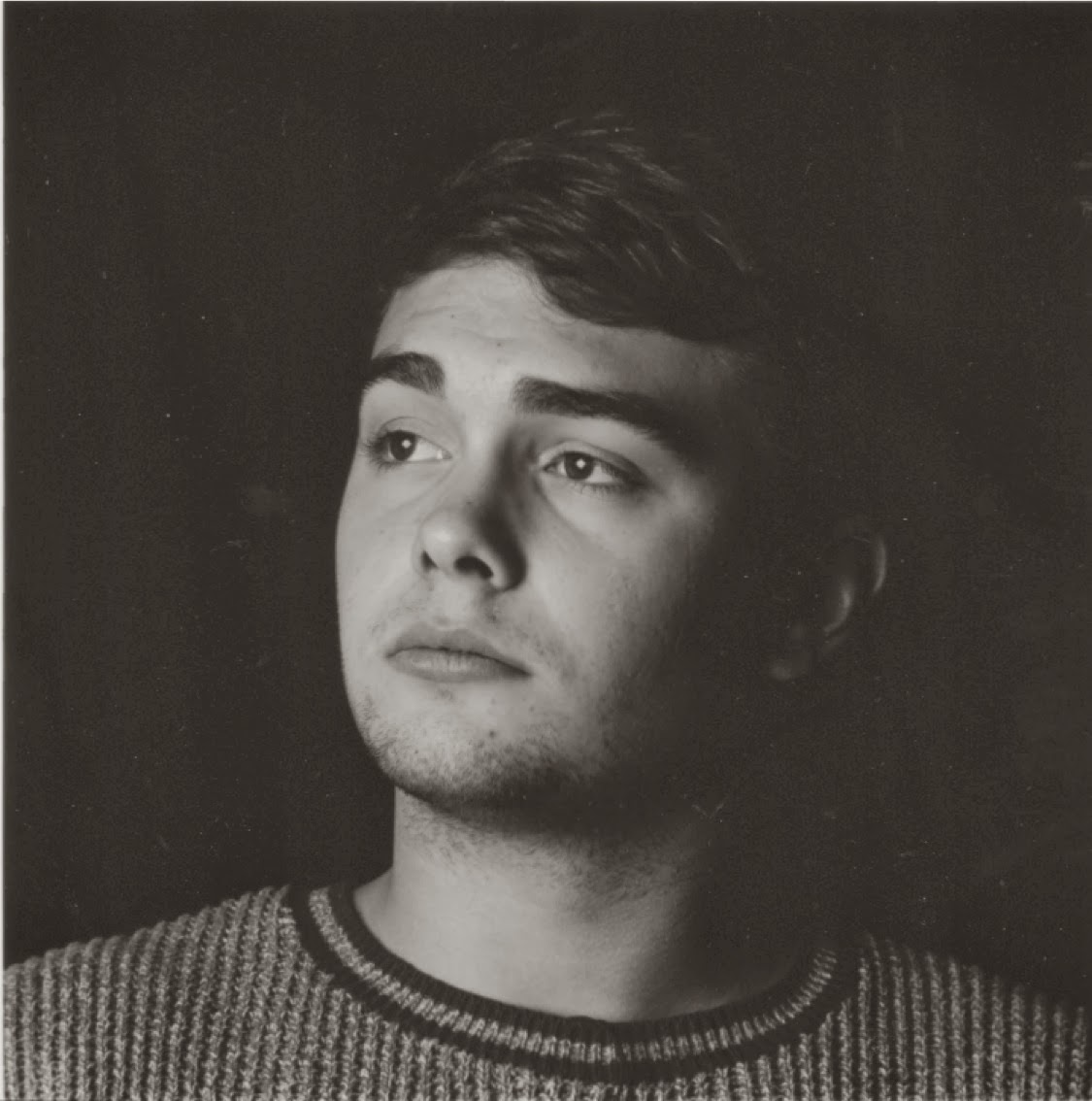
I think that the lighting on this shoot, I don’t k now why as it is basically the same as the others, is my favorite. The way it lights up her face and gives her skin a sun kissed glow is just beautiful. Also she just looks so angelic and soft. This is also complimented by the models subtle make-up. 

Enlargements: 

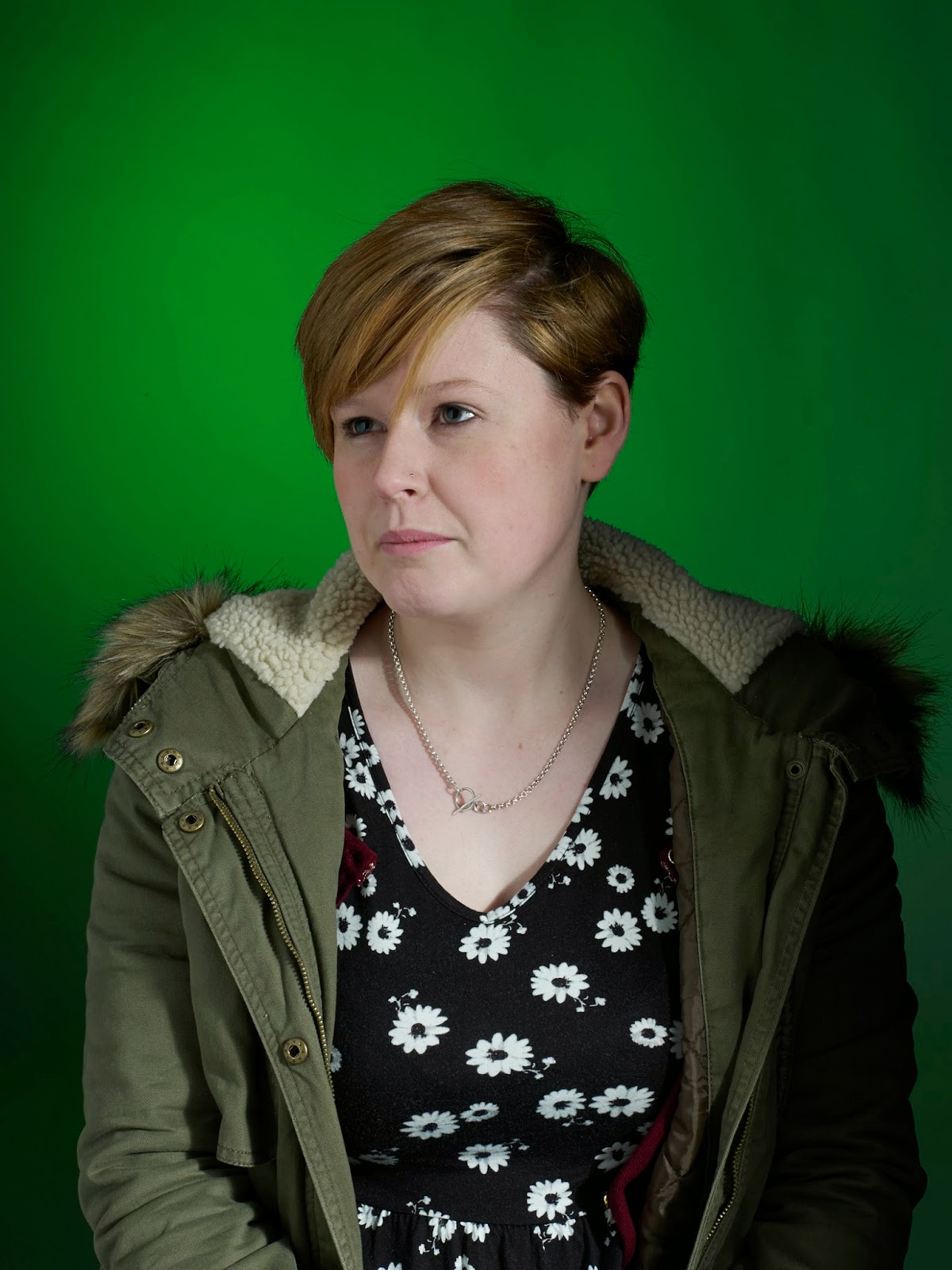
Quite a few images turned out like this from this shoot. This is because the flash aimed at the background with the coloured gel on it didn't trigger when the front flash went off. This is really such as shame because I think that this picture of Charly is beautiful. I do like it with the black background but obviously it won’t work for what I want for this project. 


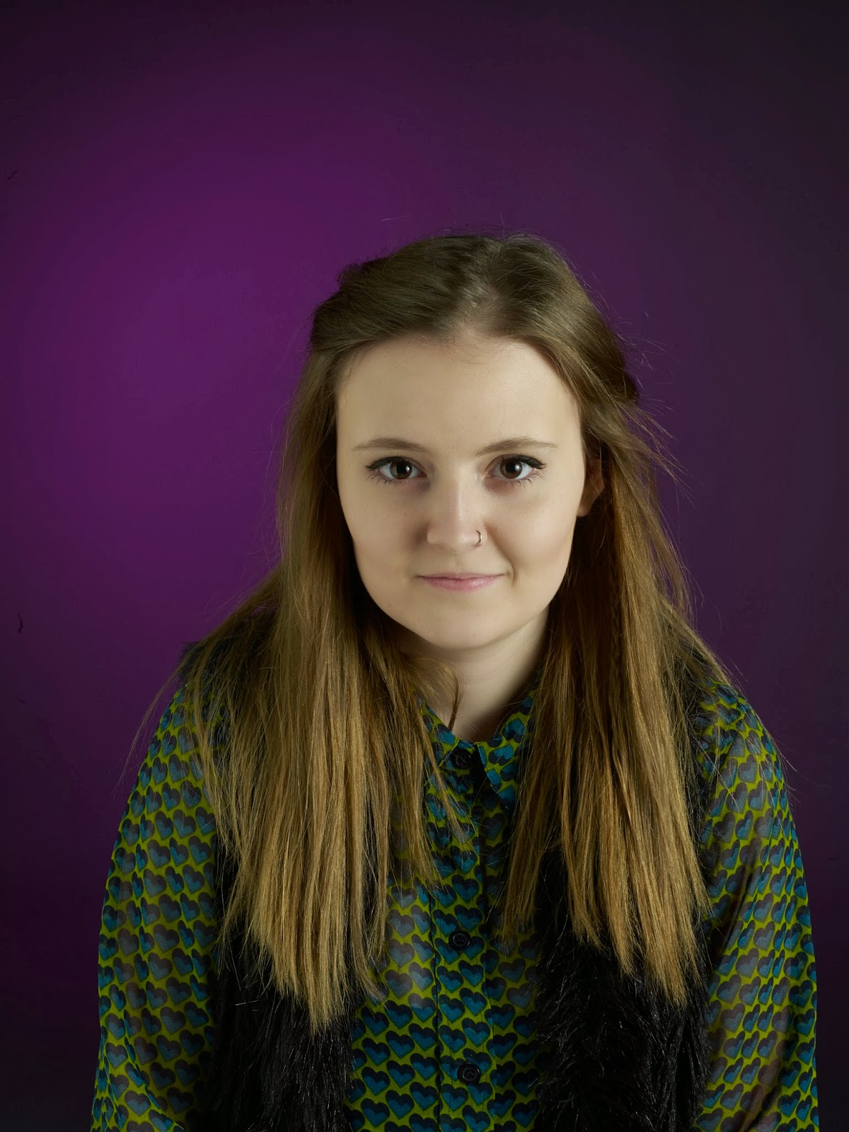
As the model felt comfortable in the shoot I was trying to get a range of expressions from her. If you know the model you would know what a lovely, caring person she is and is always there with a smile. But I wanted to try and get out of her emotion that she feels deep inside. I think that maybe she was trying too hard for this as she knew it was what I wanted and it came across posed.  Charly is always one to experiment with her hair, what she has now is rather quite tame. Maybe this is because she is happy and feeling content? This is also the feeling I get from a lot of the images, mainly expressed through her facial expression. 
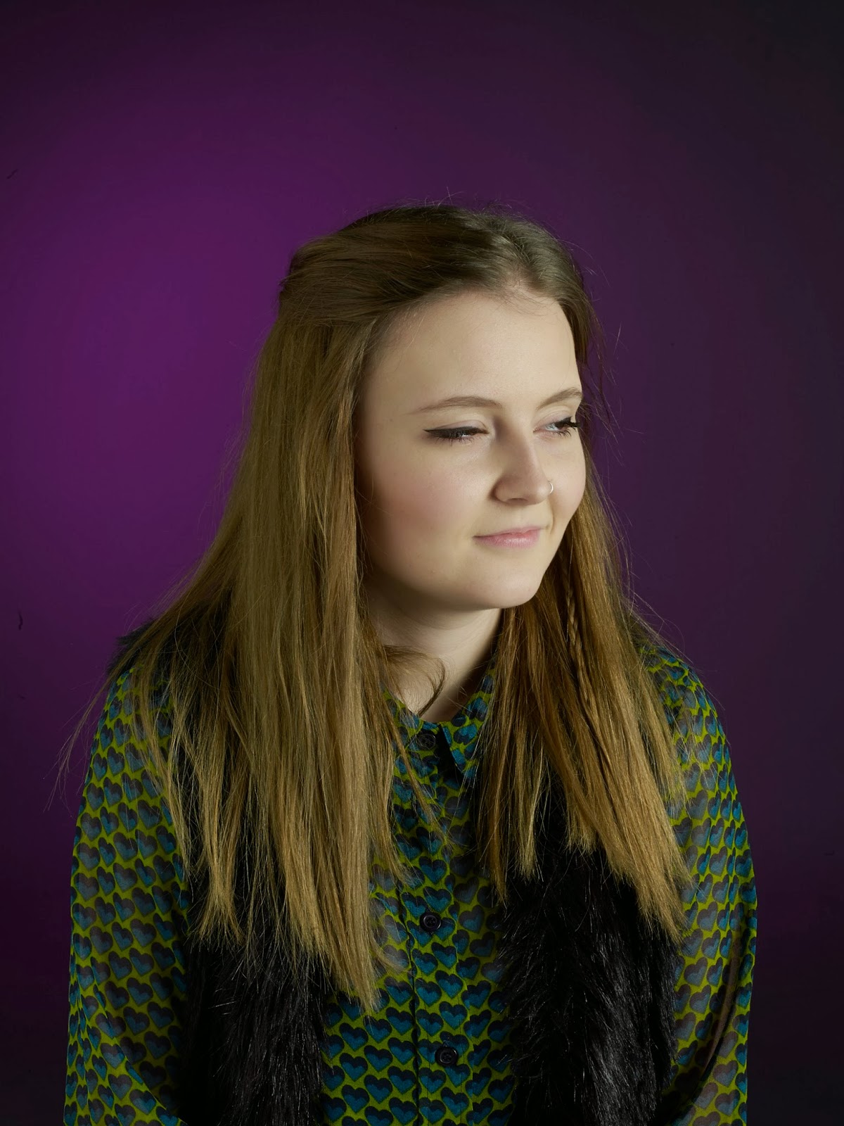
                                                           A                                         B

These images are really important. As I want to present my final images as one large final image I want there to be a variation in the directions that the models are looking and how there facial expression looks. I have tried to do a shot like this with everyone that I have shot so far but sometimes it doesn't work. However I think that Charly has got a really photogenic face and all the shots have really worked so these could be backups if I don’t get enough of other people looking in different ways. 

I prefer image A to image B as the lighting is more flattering on her face BUT most of the images will be facing this way so something that I have thought of doing is maybe flipping the image in Photoshop so that she is facing the same way as image B but you still have the soft lighting on her face rather than it be more shadowy and dark. It will be fine to do this on Charly picture as she doesn't have any writing on her clothes its rather neutral so no one would ever be able to tell. 
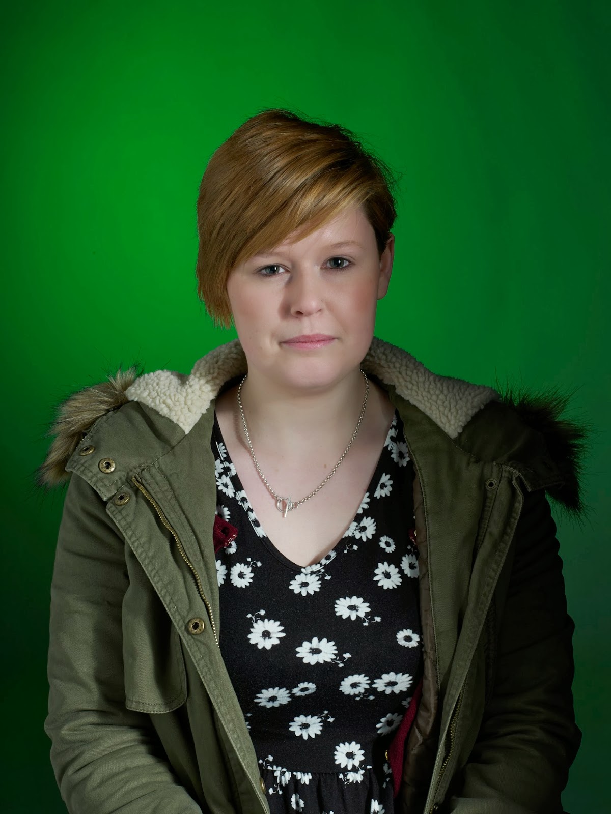
Final Image:

I think that this is going to be my final image. (Up to now may change). I just like the little slight grin on the models face and the flattering lighting on the face that I evened out with a reflector to try and eliminate the shadows on the right side of her face. I also think her eyes are really strong and seduce you. This image is very flirty and feminine. 

Book Research - The Great Life Photographers

I know that nearly all of these image have got a fashion base to them and I’m not really wanting to take my work down the fashion route but I think that they are great examples of work that can for many reasons give me inspiration and tips for my own work that might help me make the images that I produce the best that I can make them. Also I think that fashion photographs especially ones from the past really hold a class and elegance about them. They have an expensive classy look that is something I am really aiming to achieve in my work and I want it to be able to stand the test of time and also have an elegance about each image individually but also together as one overall image.

Eliot Elisofon:


Philippe Halsman:


Milton Greene:


My main reason for putting these images into my blog was not to look at the photograph in terms of technical quality but just to show the timeless elegance that I am trying to take from the fashion world and incorporate it as best as I can into my portrait photographs for this project.