Monday 10 December 2012

Fazal Sheilkh - The Circle

These images were taken from a series of images that were of woman in India. The purpose of the images was to show that the life of woman in this part of the world seemed to be going round in circles throughout the generations. They were not really going any were just doing that what there ancestors before them had done. 

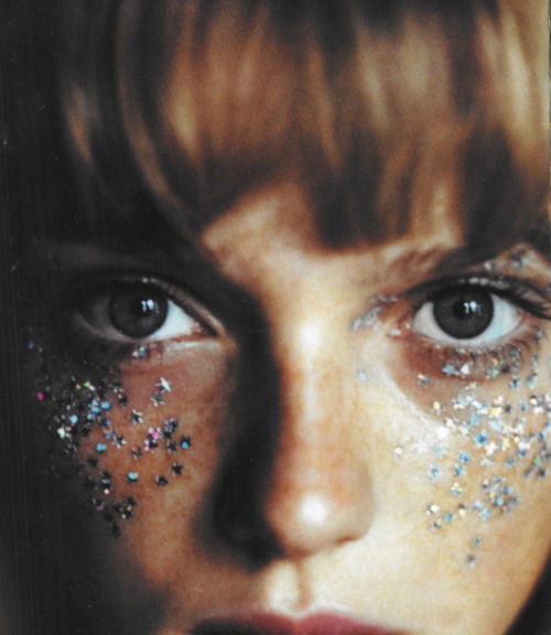
I decided to look at the images of the younger members of society. I think that its interesting because when you look at the images of the parents they look sad almost like they know what there life is and that its basically low quality. However i think that normally when you look at images of children like this they look full of happiness and dreams. yet in these images you can see the sorrow in the eyes and faces of the children. Maybe they know what there life's path is? 


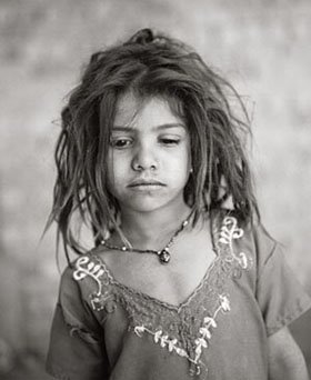
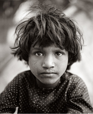
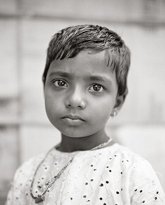
I think that the fact that these images are in black and white really ands to the intensity of the images and makes them have more emotion. There is nothing distracting you. I also really like the shallow depth of field on the image of the baby, really makes you concentrate on the face. This series of images is one i really like and think that they are really strong and hold a lot of emotion.

Visura Magazine - Alejandro Gonzalez


When we were looking at different magazines and websites the other day i realised that there was a lot of portrait images on this particular website, so i decided it would be a good resource for my research.

''The series Inappropriate Behavior is an inventory of individuals subject to rejection or exclusion because of their sexual preferences. It is a denunciation of homophobia.'' 


_5172965 as Smart Object-1.jpg    _5173102 as Smart Object-1.jpg

These are just 3 of the series of images. What i like about this series is the crop of the images. That it is really close to the subjects face so that you can see all the detail in the skin, eyes etc. The fact that there is a clear catch light in the subjects eyes makes them look really alive and also i think makes them look full of emotion. I think that these images tell a story, they seem to have a look of anger or a fed up feel. I also like that you cant really tell the gender on some of them. Its a really bold concept and i like it because i think that the images back this up.

Quick Question

when you guys are all putting images that you have shot into the blog are you going to put a mini contact sheet in?

Wednesday 5 December 2012

Notes

At the minute i seem to be looking at older style portraits rather than more up to date images. But i think that this is really helping me get a sense of what the basics are in a portrait and what i can use to help me make images that i really like. Also I'm drawn more to older images, i think that they are unique and have a eery feel to them.

Hopefully i can start to look at more newer images and pick out ones that i can work with and help me create colour portraits in a style that i like. Have a long way to go to get more up to date though.

Daguerreotype

I think that the Daguerreotype creates a really simple portrait but the format in what its been created makes some really Gothic and creepy images that i really like the style of. I also like the fact that these are one off images. Makes them special and unique. 


''The daguerreotype process was the first practicable method of obtaining permanent images with a camera. The man who gave his name to the process and perfected the method of producing direct positive images on a silver-coated copper plate was Louis Jacques Mande Daguerre, a French artist and scenic painter.'' http://www.photohistory-sussex.co.uk/dagprocess.htm
Mathew Brady
Looking up into the corner of the frame indicates maybe that he's looking into the future. I really like this sometimes i think that looking straight down the camera lens looks a bit too intense. Also he is only slightly at an angle what i prefer rather than the body to the side then turn head look.

Of -  Edgar Allen Poe
 This is my favourite of the daguerreotype images because its just creepy and i think that it is a really strong image. I think that it adds tension and gives a Gothic feel for a few reasons. One being the way that the subject is staring with this evil glare right down the lens. Another reason is because of who the image is of and what he is known for. I even like the marks on the image around the black areas of it. I think i prefer the scuffs and scratches there. 

Image, Source: b&w film copy neg. post-1992
Mathew Brady - 1844/1860
I'm not too sure if the scratches and marks on the images are part of the image itself and done on purpose or they are just what has happened over time but i really like them. The pose and style of the image is what i picture as a typical portrait image. Like the ones that were around the room in the miners place in Newcastle. Really traditional and sat to the side.

Johnny Cash - God's Gonna Cut You Down


I have decided to use this video as part of my portraiture research because it contains a lot of celebrity's in the video. The video itself is made up of like a stop frame animation almost and during it stops and shows a portrait image of quite a lot of the celebrity's. I think that this is really nice because it shows you detail in the faces and also has really nice framing and composition. So i have pulled a few of these images out of the video to see clearly and easily.

Johnny Depp
 I think that this is my favourite image from the video. I think that the lighting is really soft on the models face and i like how he just appears out of the darkness, kind of loose the detail of his hair. Also the small catch lights in his eyes make them pop out of he image and give life to the subject. Also like the tone of the image. its not exactly black and white. 

Kanye West
These images seem really cropped into so that you can see all the details in the subjects face. I think that this is so that you can almost read the emotion in the face. Its in contrast to the rest of the video what seems almost jumpy and busy. The parts that show the picture tell the emotion. 
Kate Moss
 I think that in this image model looks a bit lost and you loose the details in her eyes. Also its quite dark no really shadows or highlights like the rest of the images. Over all quite flat. 

Keith Richards
Same with this image, again no life in the eyes, i think this is because you cant see the detial in them. The image itself though is really dark and you can only see parts of the face clearly. I rather like this style if only the eyes had more spark in them.
Iggy Pop
I really like this one because of the lighting in it. Its really bright and you can see the catch light in the eye what gives it life and also emphasises in the models emotion. I like the way that you loose all detail in the left hand side of the subjects face. Again really cropped into. 

Bono
This is the unique one in the video mainly because its more fun and not as serious as the rest. I think that the other images have a lot more feeling and emotion in them and i don't really know what this one is about. Could you even class it as a portrait with the fact that you cant see the eyes? i don't know i don't think i would.

Portraiture Paintings

I want to look at paintings because they really are the first type of portraits and it will show what a traditional portrait was like and the feel that the image had. Also portraits in the Renaissance period started to get a lot more advanced and became almost more photographic in the detail that they captured.

Antonello Da Messina - The Announcement 1475
This point in the Renaissance period is were the artist started to incorporate more detail and began to create painting what had a lot more detail in the faces of the models. It captures light, detail and also can kind of indicate emotion in the image. Also in this image the painter has begin to make the subject appear more life like by adding gestures and the indication of movement in the image


Giovanni Bellini - Portrait of Doge Leonardo Loredan 1501-1505
This painting almost looks like a photograph with the amount of detail that the artist has put into the face of the subject. He has really captured the way that the light hits the subjects face and how it highlights areas such as the cheeks and under the eyes (almost Rembrandt lighting). Also the effect created on the material of the models clothes by the light. Painted between 1501-1505, you can really see a vast improvement from the amount of detail in earlier portraits. (such as the announcement).

 I think that these are really good images to reference because they really start to capture detail in the models faces really intricately and also the use of lighting and how it effects the image and the shadows and highlights it creates on the subject. Shows the advances in paintings to the point were they are almost becoming photographic.


Also some of the most famous portrait images are paintings. For example the Mona Lisa by Leonardo Da Vinci -1503-1519. This has started to incorporate land like old capitalist American portraits were people used to get them to show off the wealth, however i think that this is done in a more scenic way to make it appear like the model is sat in this location. Shows lighting on the model and all the detail such as shade, highlights and facial expressions. But also perspective in the background, by the way that the road vanishes into the distance and also the loss of detail in the trees. 

Julia Margaret Cameron

These are two of my favourite portrait images by Julia Margaret Cameron. These were not shown in the book that i used previously as part of my research so i decided to put them in separately. I this that they have both got a Gothic, creepy feel to them what i really like.
 
The fact that this image has quite a close crop makes you see the image clearly. It maybe might have been too dark if it was not as focused on the models face. The lighting is really soft on the face and doesnt really create dark shadows, unlike the image below. 


I especially like the way that the light is hitting the model on this image. Really highlights the features on one side of her face and makes the model really stand out from the back ground of the image. Appears to be a quite shallow depth of feild to the image because you can see that the models hair is blurred and so is her neck. This makes you concentrate on the models face more rather than the hair and neck/shoulders.

Tuesday 4 December 2012

Thomas Ruff


I decided to put these images in as research because after our first lesson on portraits this is what i had in my head of what a portrait should look like. However there has been a debate that these arnt portraits. They don't have any feel or atmosphere to them. There basically just passport photos.

'Ruff embarked on a period of research into the history of portraiture and carried out his own experiments with composition and framing. He decided on a style of portrait that would be as neutral as possible, with the aim of emphasising the face of the sitter. Ruff requested that his models try to be expressionless, and each one was photographed wearing their ordinary clothes, against a plain background' - http://www.tate.org.uk/whats-on/tate-liverpool/exhibition/thomas-ruff/thomas-ruff-portraits

I do however feel that they do give you  a feel of what the person is like because you do see there clothes and i think that you can tell quite a lot of a person on the basis of what they are wearing. So maybe this is something that i could think about in my own portraiture work. Its not always about the facial expression, could be clothes, accessories (as long as its there normal attire, don't want to get too fashion-esq)

Thursday 29 November 2012

Something i like


Queen Elizabeth II, by Marcus Adams, February 1939 - NPG  - © estate of Marcus Adams / Camera Press
Marcus Adams
I came across this image when i was looking on the National Portrait Gallery website and i really like it. I think it has a really soft feel and inocence to it. I like the way that the model has been styles and i think it all together makes a really nice image. Didnt think i would find one like this of the Queen were she looks so, well normal. But i find it striking

Libary Nightmare

I have been sat in the library trawling through books to try and find some usable colour portraits as i feel like everything Ive put in my blog so far (and everything in the massive pile of drafts i have managed to stack up) all seem to be black and white. I feel that everything in colour seems to be fashion or going into a more documentary look. Can anyone fling me the odd book or photographer name please as a starting point? Would be appreciated!

Wednesday 28 November 2012

Julia Margaret Cameron - From Life

I took a book out of the library as i knew that Julia Margaret Cameron did a lot of really nice early portrait shots. The book was called 'From Life' however this was not what i expected it was a lot of words and only minimal images so i was only able to find a few nice portraits that i liked. 


This image is the lightest out of the 3 that i have chosen from this book. I really like the way that the young girls face is framed by the white sari that she is wearing. She doesn't look as dark or creepy as the other two images. Gives a feel of innocence and purity. She doesn't however look very happy. Maybe this is because she had to stay still therefor had to keep a straight face?


What i like about this image is the way that the man appears from out of the shadows. Its really dark and has a kind of creepy feel to it. I like the way that you cant see where his body is its only his face in the light. There is really nice lighting hitting his face from the left hand side what highlights his features on the left side but isnt bright enough to highlight his body or most of the right side of his face.

Friday 23 November 2012

National Portrait Gallery - Queen Elizabeth

I was watching the news the other day and it showed a range of Andy Warhol images that he had created of the queen. It was part of a gallery she is putting on (or something) and it showed a few other image of the queen and i immediately thought that this would be good to put in research for my project. 

Queen Elizabeth II, by Marcus Adams, June 1927 - NPG  - © estate of Marcus Adams / Camera Press
Marcus Adams
I really like this. Thought id choose a range of ages and show how they have changed, or show how certain aspects have stayed the same. There is light hitting the back of her head creating a glow from her hair. Gives a kind of innocence and purity to the feel of the image. Also looks like a real shallow depth of Field because only really her eyes and face features look in focus.

Queen Elizabeth II, by Yousuf Karsh, 1951 - NPG  - © Karsh / Camera Press
 Yousuf Karsh
Really like the lighting on the front of the Queen in this image, you really get a lot of tone and shades due to the light hitting the silk on the dress. It also makes the necklace and the crown really shine. Again there seems to be a spot light hitting the backdrop making her appear with a glow. Also there looks to be light reflecting or maybe pointing onto the back of the Queens head what gives that kind of old Hollywood feel when highlighting the back of the hair.

Queen Elizabeth II, by Dorothy Wilding, 1943 - NPG  - © William Hustler and Georgina Hustler / National Portrait Gallery, London
Dorothy Wilding
This one i have chosen because there isn't so much fuss with lighting on the back drop as there is in the other images. There doesn't appear to be any soft lighting to highlight the back of her hair etc. However i think that there may be 2 lights or a reflector to capture the bright light all over her face. There isn't really any dark shadows. The face looks really soft.

Queen Elizabeth II, by John Swannell, November 2001 - NPG  - © John Swannell / Camera Press
John Swannell
This image looks as though the back ground has been lit separately and that the Queen is stood quite far away from the backing as she appears to be really bright and stand out in comparison to the background. Also looks like there is a spot light aimed at the back (maybe just behind the Queen) to create this glow around her. Also gives a kind of importance to it.

Terry Richardson

Something that i really like (what i didn't think i would) is the framing of the images below. I like the way that they are more to the right hand side of the frame and that there is a area of negative space to the left. This is because the image has been taken landscape were you would normally expect it to be portrait format. 
 
Terry Richardson - Charlotte Free
 
Terry Richardson - Mila Kunis
Also the lighting in these images makes it so that there is no shadows on the models faces. There isn't really a contrast. You can see all the details of the face clearly without loosing detail. This is created by using a flash straight in front of the model. For example the flash on the camera. Does however create harsh shadows around the model that show up on to the back drop.

Blue Steel


Shoot - 1

After today's session had finished during lunch i decided to do my first shoot using Rachel as a model. We used the studio one cove, with 2 strobe lights hitting the back drop with reflectors bouncing the light back onto the white background. Model stood in front of these reflectors with a soft box pointed at her from both the left and right (alternated during the shoot) I feel like the shoot was going smoothly and managed to get the camera focused right pretty much all of the time. However i forgot to do a test shot holding the card i would use late to add the right custom white balance. So below is an image from the shoot and then I'm going to go back and do the shot so i can get the right white balance.


Image One
I like the image. I think that it has been framed really nicely and i also really like the expression on the models face. However i feel like her skin tone just doesn't look right and also the back drop looks a bit gray so i think i need to go back to do the test shot to see if this will change these faults.

                                               1                                                             2 

                                            3                                                                 4

5

  1. As these were some of my first shots i wasn't expecting too much, just having a play around. Harsh shadows. model looks orange (what she clearly isn't) really like the colour of the backdrop and the lighting that's hitting that. Also nice catch lights in the eyes.
  2. I think that this is a really nice pose and i like how she is leaning towards the light with her hair scraped to the side. I think that the light is hitting her features better in this image. She looks rather girly.
  3. Only see one side of the face. I wouldn't want it for my images but kind of like it in this shot.
  4. Far too dark hardly see any detail in the models face. 
  5. I dont like the framing of the image. Too dark again. Background lighting is nice though. Like the models face and really nice light in her eyes. 

David Bailey

....I have decided to re-post this post as it is relevant tot he work i am doing now....

There are a lot of these square medium format images from David Bailey called 'A Box of pin ups'. I decided to look at these 2 thought because it shows both a single image of one person and also a group.


Mick Jagger - David Bailey, 1964
To me this image kind of looks out of focus (but im not too sure if its just my dodgy eye playing tricks on me). I like the framing of the image and how the top of the models head is slightly cut off. Also like how the arms lead off the end of the frame too. I dont really like it if there is a bit of a white edge to the image.

The Rolling Stones - David Bailey

I like the idea of a group portrait. I think it gives a little something different to the usual set up. I also really like the lighting in this image. How you kind of loose the detail on one side of the models faces because of the such harsh lighting coming from the left of the frame. 

Saturday 17 November 2012

Paolo Roversi - Are all fashion? (mini rant)

would all of Paolo's work be classed as Fashion? I understand if there is over the top makeup and hair done, for example the one below..

The Shining Paolo Roversi

But i just don't see how simple images that look un-styled and really quite natural cant be classed as a portrait? fair enough you could say the clothes she is wearing are being advertised but what do you expect her to wear?
I just cant get my head around this and I'm really finding it hard right now to get this  project and what I'm meant to be looking for.