Saturday 26 January 2013

Paul Cezanne

1839- 1906 - Life Span

I have decided to only pick a couple of his paintings out to look at. There is a vast variety of paintings on still life from Cezanne, however i think that they become slightly repetitive and some look really similar to each other.

Tulips in a Vase
What draws me into this image is the use of colour. I think that the bright blue with the red flower heads on it helps to shape the flower and identify what they are. the contrast in colour helps them pop off the page. They don't get lost in the background. Also i like the bright head of the flower in contrast to the dark green tone of the stem. Light appears to be coming from the bottom left that really nicely highlights the apples and oranges on the bottom of the table. They look really bright and i think help brighten the image up more, without these there would only really be the tops of the tulips (image looks darker without them) 


Still life with apples and a fruit bowl
I think that this has a lighter feel to the one above, maybe because of the use of a white background. The apples are also painted in nice bright and vivid colours. There has been a lot of detail has been taken in painting the creased up sheet in the image. Highlighting the folds in the fabric and also the overlay of it. Also think that the subtle pattern in the wall paper sets it off. I like the composition of the objects in the painting. Its not in a traditional central composition what i would have expected from an old still life painting. 

Vanitas Paintings

http://www.timetrips.co.uk/still_life_history.htm


"A Still Life is a work of art, a drawing or painting (usually) of a group of objects. Objects do not move, hence the word 'still'. In the past these objects tended to be flowers, fruit, and other kinds of food or dead animals - hence 'life'."


Vanitas Paintings: 

the idea behind Vanitas paintings was that it was in reference to a passage of the bible in revelations. They would paint a skull representing death or the coming of death yet paint all rich and expensive possessions around the skull. It shows that people are really vain and only care about the richer things in life but what does all that mean and come to once your dead? they don't come with you! so why be so attached to them in this life. 

Hermen Steenwijck - Vanitas (1640)
This painting is really quite full of detail. I like the beam of light that is coming from the left hand side of the image that hits the skull in the centre and really illuminates it. There is also simple detail put into the pipes and the shell on the table. Its subtle and not too in your face but the more that you look at the image you begin to see the details more clearly and more things seem to become noticeable. This is what i like about it. Its not too busy all at once and in your face. 

Vincent Van Gogh

As soon as you say 'still life' the first thing that comes to my head is Vincent Van Gogh's name and the painting he did of the sunflowers. So it only seems right to begin my research at this stage and work my way back to the present.


I don't think that this is very realistic but you can see a lot of effort has gone in to the painting. I like it because its simple not over the top. You can clearly make out what it is, yet its not full of detail down to the last petal. I really like how vibrant the painting is. The use of colour gives a positive feel, its bright and fresh.

Monday 21 January 2013

New Brief

Well i wasn't too sure what we were going to be doing for our next project, but safe to say i am really happy. These are both two genres of photography that i haven't really looked at or attempted before so it will be a new experience that hopefully will teach me some new skills. Also really looking forward to experimenting a bit with these areas.

Friday 18 January 2013

Evaluation

To find out we were doing portraiture for our second assignment was a relief.  After the stress of street photography I was happy to be spending my time back in the quietness of the studio. It’s something I think I already had knowledge about and felt like I could push myself to try and get some really striking images.

I began by thinking that I had an advantage as I did portraits for fmp work before and though I would have a wide range of research to use. However I changed my mind and decided to start from scratch and look at a whole new group of photographers and artist. I think that this was a wise decision to make as I wanted the images I was about to create to be different to what I may be produced before. My research started looking at the basics of portrait photography what I think really helped me get an understanding of the genre and 
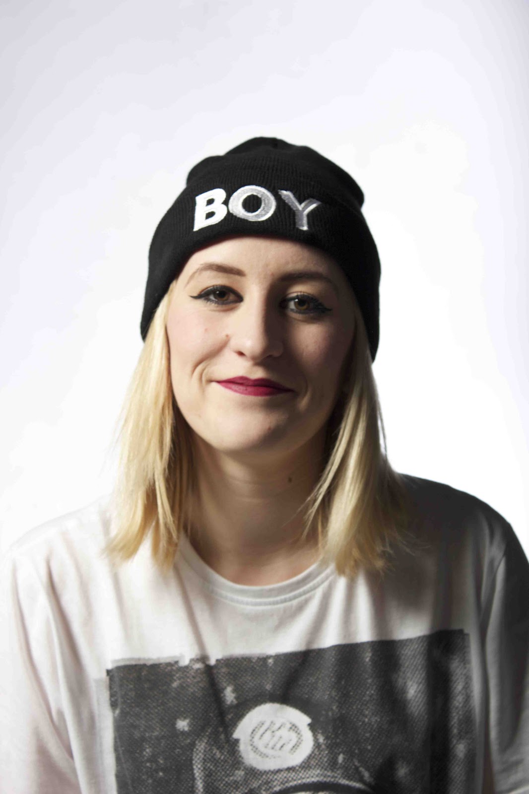
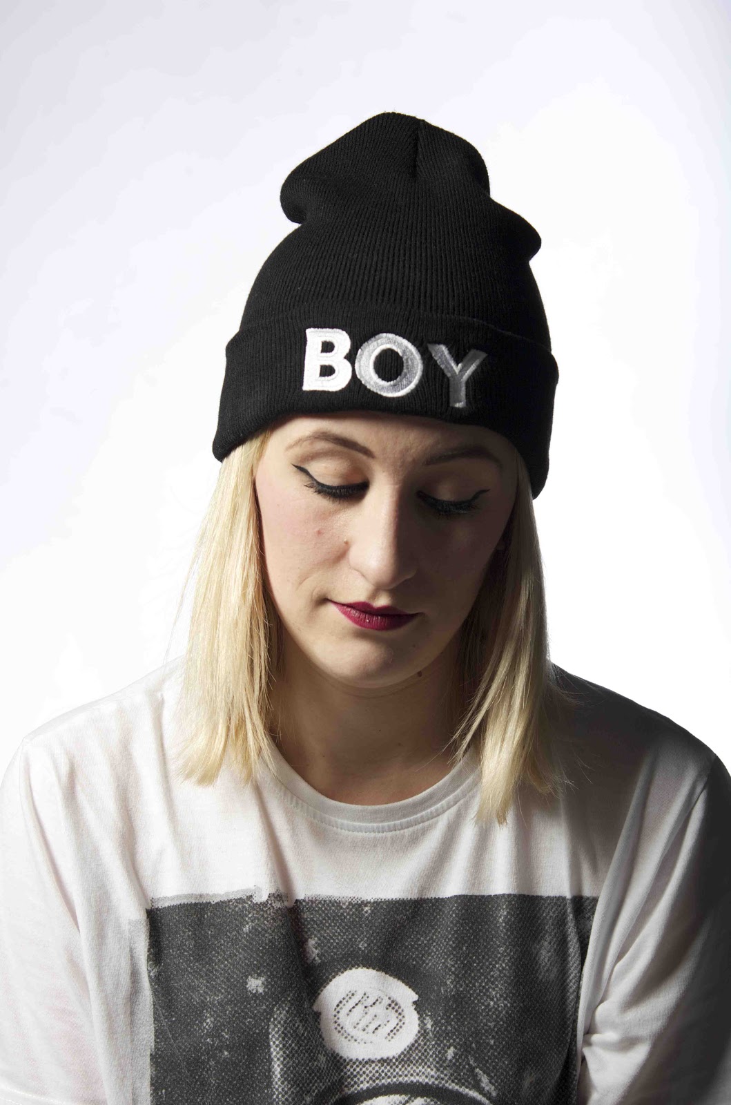
what I wanted to do with it. They were simple and classic. This was going to be my angle to target. Something simple but speaks for itself and didn’t need much work doing to it. Not that I’m lazy just wanted to see if I could come up with something I was happy with straight away rather than manipulating so much that 
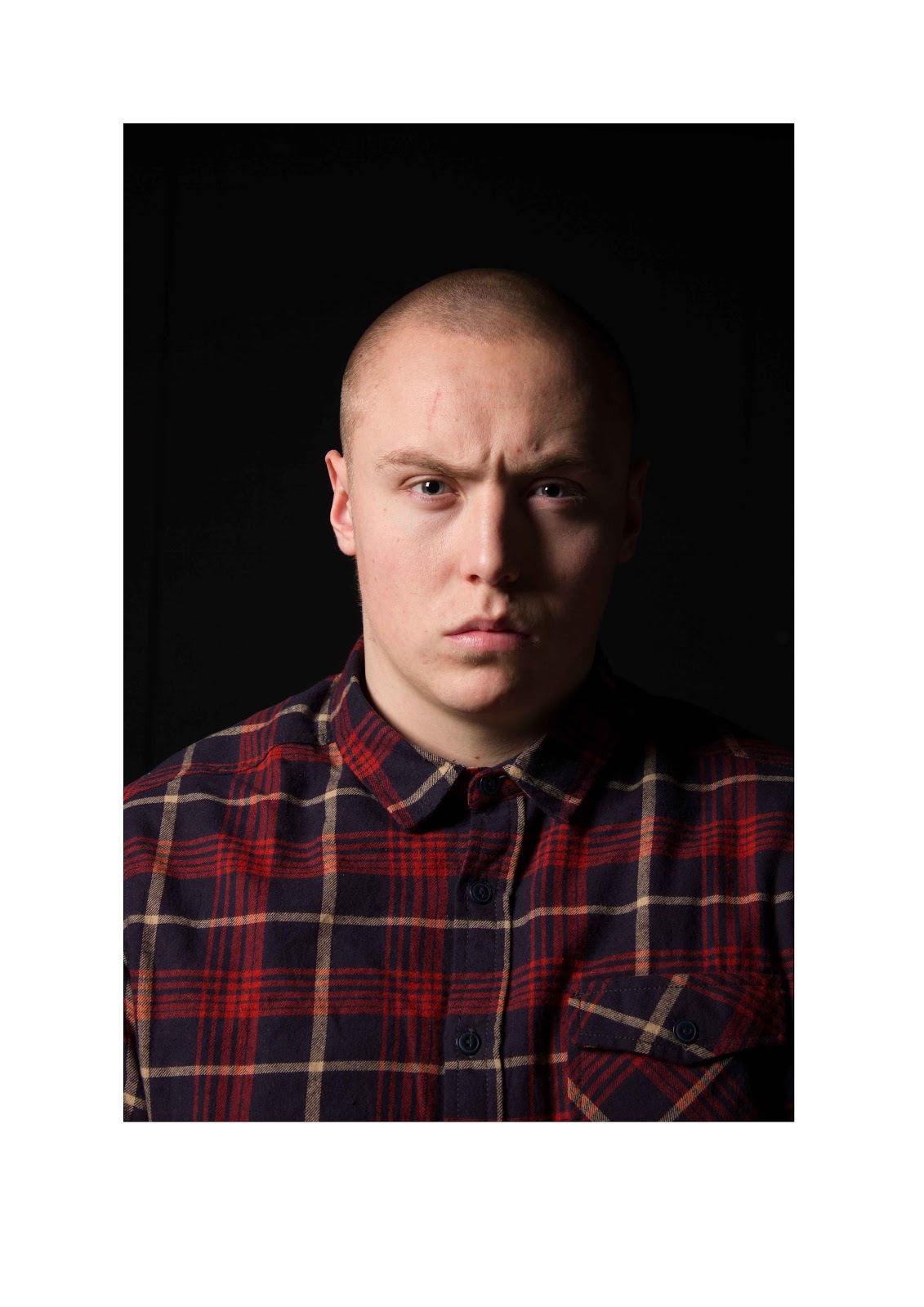
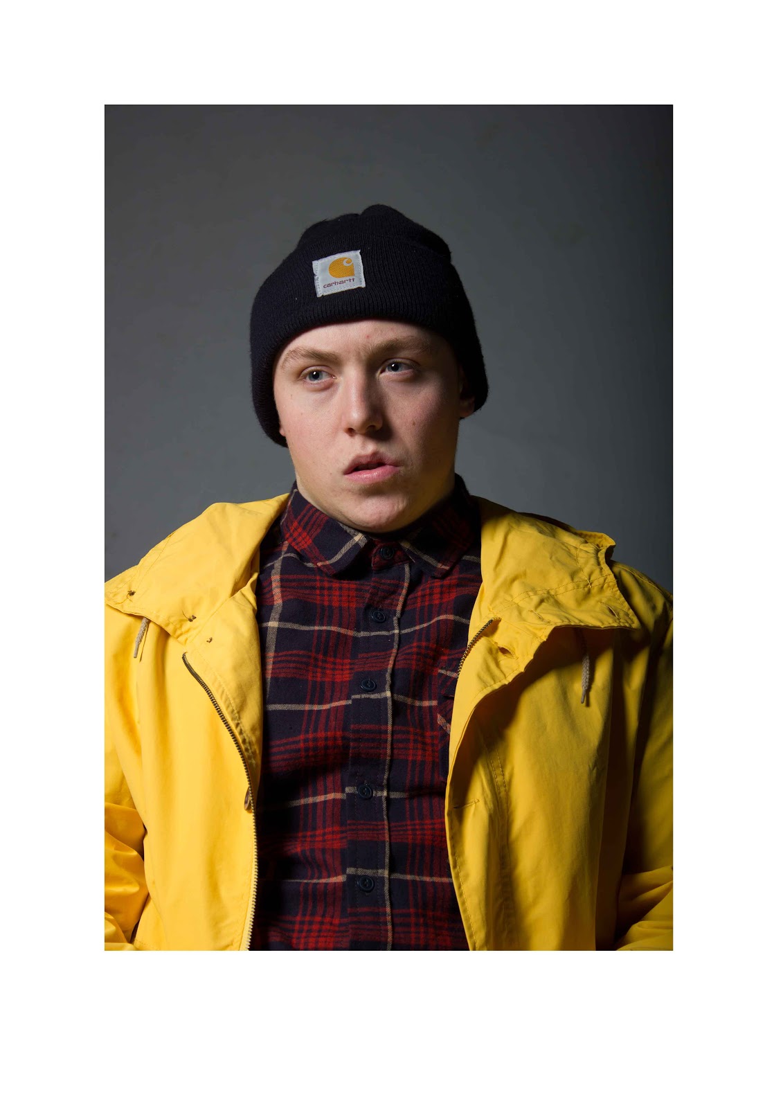
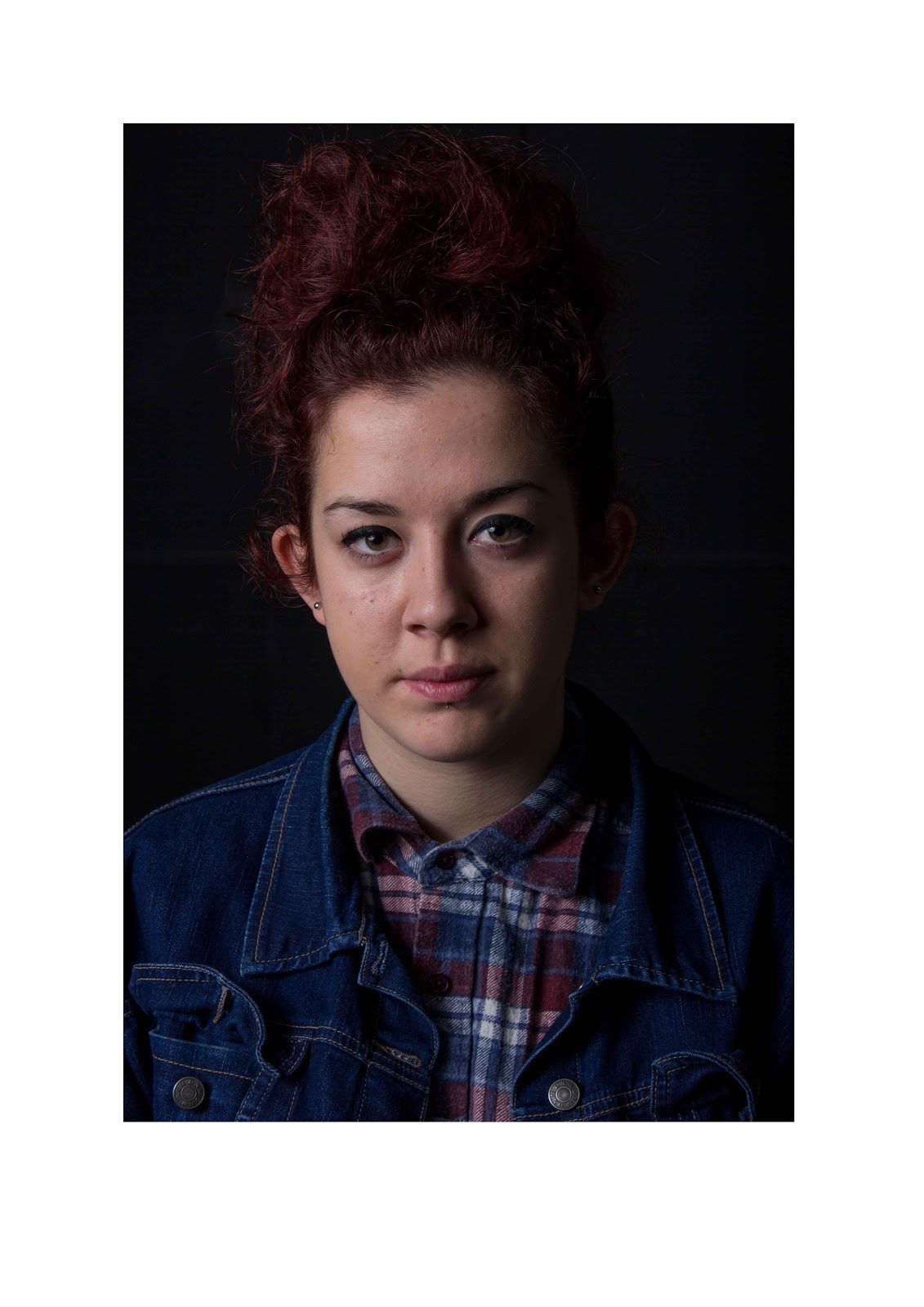
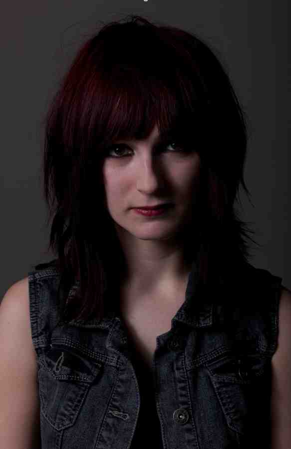
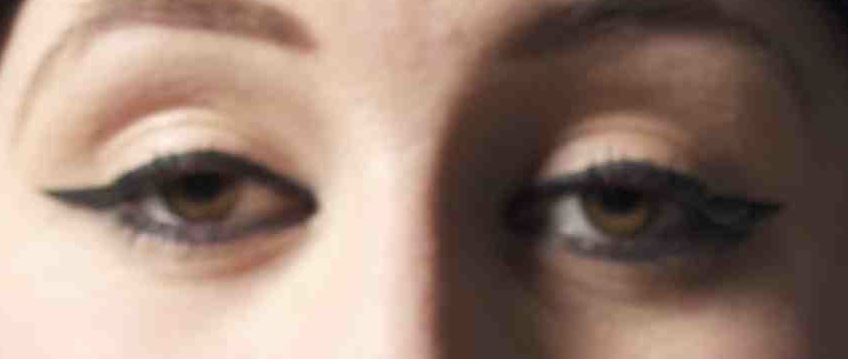
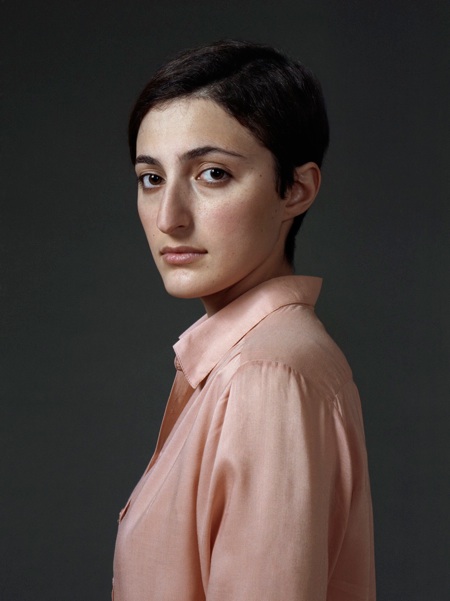
it was no longer the image I too. Photographers such as Julia Margaret Cameron and Louis Daguerre made me realise that a simple head and shoulders shot was the key to capturing my images and they also created a mood around the image and the model. They had a formal and timeless feel to them. Unlike there work 
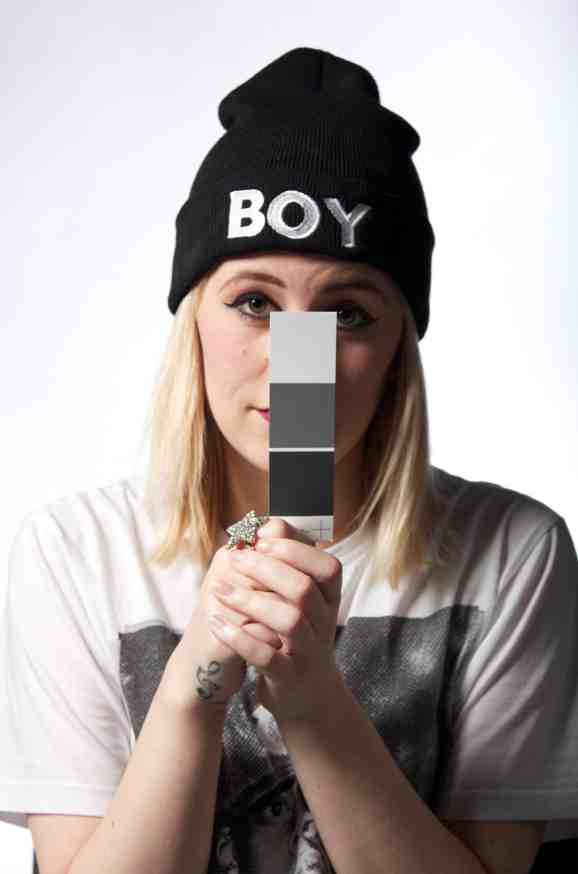
though, I wanted to do this in colour.

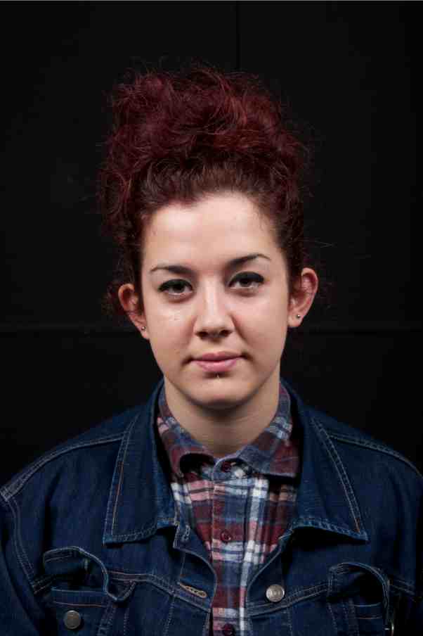
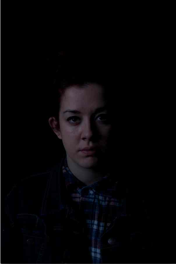
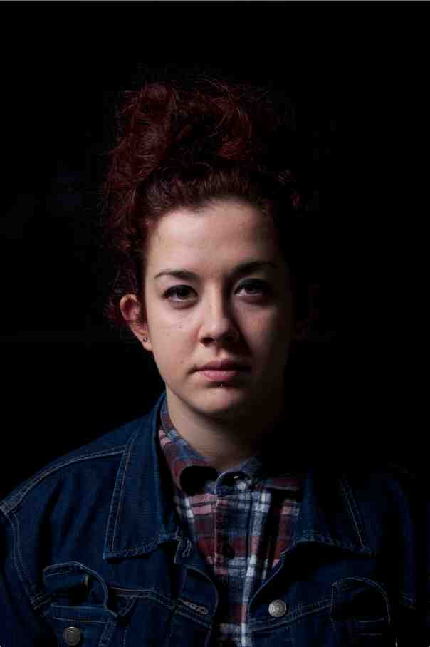
Loaded with ideas and a set focus of what I wanted my images to look like I went to the studio. I thought about using the same model and just showing how lighting can affect the mood of an image and the mood it portrays. However I thought that this might be quite limiting so I decided to use a range of people. The shoots were simple enough as I already had a good understanding of how a studio works. It was just a case of getting used to how the new equipment worked. I did run into a few problems when it came to this, for example I’m ashamed to say I could not get the camera attached to the tripod and had a bit of trouble getting it to stay in position. But these were silly errors that I eventually sorted out.  I tried to get as many factors as I could exactly how I wanted them during the shoot such as crop, framing, lighting and colour balance so that I wouldn’t have to do much editing after the shoot and the majority of the time I’m glad to say I did this successfully.

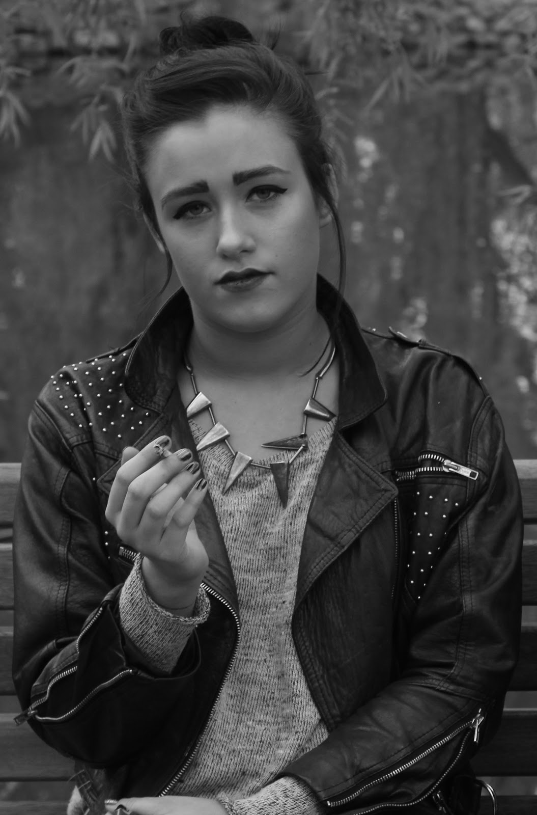
When it comes to choosing my final images I don’t think I had any doubts. In my eye it was clear that the images stood out compared to the 
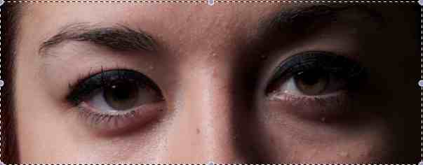
rest when it came to the factors of focus, if they had a clear catch light and also if I actually liked the image. I am really happy with my outcome and also with my will power not to turn them into black and white what always seems to be my back up safety net. I think that they do show the moods created by different lighting and the lighting enhances the models and makes the images really nice in my view. I’m really happy with my outcomes and think that this project was successful over all.

The fact that I have overcame my problems with blogger in the last project it seemed a lot easier to carry out research and post stuff on this project. However some problems I ran in to were the fact that blogger seemed a bit temperamental and I often had problems getting it to run or even be able to upload images. Other problems throughout the project were simply trivial aspects that were resolved almost instantly such as ordering the images where I ordered 1 matt the rest glossy, resolved through simply ringing the company. However I think that the project ran smoothly as it could.

Over all I am really happy with the running and also the outcome of this project. I think that I worked efficiently to produce a set of images I am really proud of. I used a range of research that has shown me new styles of photography and also new angles on the genre. I have a real passion for portraiture and I hope that that has shown through my work.

Final Images

The are my final 5 images for this project.  I wanted my images to be really simple and be edited as little as possible. I also wanted to try out a range of lighting and also backdrops. Just used what i think complimented the models mood and personality.

This image became one of my final images because i really like the brightness of the image. Alot of my work throughtout this was dark and used harsh shadows however i like this one because it is the opposite. I like the crop of the image and how you can clearly see her face. Her eyes look really bright and pop of the page, they really light up. I like how there is a clear definituon between the model and the backdrop. Also how the backdrop isnt too bleached out.

What i like about this one is that the facial expression is almost enhanced by the darkness of the backdrop. Think i have captured rembrant style lighting shown by the little triangle under his eye. Happy that i also caught a really strong catchligh in his eyes to make it not as dark and make the image feel alive. Again i think that this represents the mood of the model.

I chose this one to show how i changed the lighting to highlight the mood. Hes more calm and relaxed unlike the image above so thats why i used lighter lighting set up and made the model more clear and defined. I think that the bright colours in his jacket really brightens the image up. I also am really happy with this image because i like the natural expression on the models face. I think that this may be my favorite image from the shoot.

What i like about this image is that it doesnt look over thought or edited. Its natural the model isnt over styled. Theres nice almost natural looking lighting. It just like it because it shows the use of a dark back drop what i normally think makes an image look moody or intense but the lighting highlights most of her face and makes it soft. I just really like it. Also it was really hard to try and make the eyes look alive in this shoot so im really glad i got it in this image.
 

This is an image that i am really proud of. When shooting rachel she always looks so intense and strong however in this image i think that she appears really soft and calm and almost pensive. I think that it has a reather calming feel and its something i didnt think i would get. I also like how light and fresh the lightijg has made her skin. Also im proud because i did hardly no editing at all apart from white balance. I also really like the framing of the image.

Thursday 17 January 2013

Shoot - 6

For this shoot i moved the model i used the same lighting set up as i did for shoot 5 however for this one i used a gray backdrop so that it wasn't so dark as the previous shoot. I did this as i wanted the model and the image itself to look a lot softer.

                                                 1                                                            2

                                                   3                                                           4

 5


  1. I really like the framing of the image and how the models face is slightly angled to the left. She looks in proportion and i like her expression. Colour balance needs editing as well as maybe minor other things over all I'm rather happy with the image. Nice shadows. Minimal catch light what is unfortunate. 
  2. Even though this is a natural shot of the model its not what i am looking for. I don't like that you cant see her eyes. Also just wanted it to be upper body shots and don't like that her hand is in the shot.
  3. This is by far my favourite image from the shoot. Its exactly what i was hoping to do. I really like the lighting and also the positioning of the model. Slightly cold tone to it but this can be mended. Maybe need to crop slightly too.
  4. Really close framing so that you can see the detail in the models face. I like this shot too Think its strong and this is emphasised by her looking and facing straight down the camera lens. 
  5. Too far away. Don't like the models facial expression. Not much light on her face and i think the fringe on her face makes you loose her eyes. Maybe could have done with a bit more lighting on the model to highlight her face more. 

Cropping/Framing

(when i was thinking about writing this post i had loads of images in my head that all types of crop and framing and also camera angles and now this is all i can find... what a joke)

Cindy Sherman
What i like about this is the high angle of the camera. It makes the model look vulnerable and scared. This could be used in a portrait aspect, maybe making the model look in an inferior way. Maybe stood above them and just there eyes looking up? also would really need to think about the lighting, wouldn't want to loose any detail in the lower part of there face.

Steve Pyke
I think this is a perfect example of an image that is really cropped into. I think that it works so well because normally you rely on the eyes in a shoot but in this i can tell who the person is in the image straight away. I think that this is a good concept but to do this is my work i would have to have noticeable faces and that would be hard. Maybe i could crop my images but not actually crop out the features of the model.

Lightroom


For some reason it wont let me copy and past and also upload images from my documents to blogger. I just wanted to put some step's in for me to remember for the next time that i use Light room. I resorted to getting an image of google images so i can see what it looks like and easier to remember what it looks like and jog my memory of what to do.
 

Just a few notes:
  • When opening lightroom make a new session - preferably on my hard drive so that all the edits, originals and also images that i may delete from the session will be saved in mini folders so its better to have them saved somewhere with a large storage capacity.
  • Import images - can import all images from my card or choose individual ones that i might want to edit for some reason
  • Every move or slight alteration will always be recorded when i make them so i can go back and forwards to see what i did and see how i prefer it.
  • Don't save over original, can however make multiple similar or the same copies easy and quickly.
  • Can edit colour balance, levels, saturation and many other options. Light room is better because its main function is to edit photos unlike photoshop what is graphic based.

Shoot - 5

I wanted this lighting set up to be really dark. The model almost appearing out of the shadows. I didn't use any lighting on the back of the model or the back drop its self. I used the same lighting set up as another shoot. Just a simple light with a soft box attachment positioned high on the left hand side of the models face.

                                                    1                                                       2

                                                  3                                                          4 

                                                   5                                                          6

7


  1. Image is really bright. Can see loads of detail of what is in the background (crease in the back drop) Also the models face looks really bleached and shiny. I don't like this shot at all.
  2. Models eyes are closed. Again really bright/harsh lighting on her face. Just not usable at all i don't think.
  3. Maybe looks a bit blue but is starting to become what i would like. Need to set the colour white balance on light room. Also need to try and produce a better catch light in the models eyes.
  4. Same again no catch light at all in the models eye. Really makes the image lifeless. This is something i think is a necessity to have. The lighting however appears to be getting slowly better.
  5. Far too dark. Loose the model almost and again white balance is way off. Also don't like the framing of the model in the shot. Head in in centre what i don't really like think it makes her look stumpy.
  6. Very cold. Nice framing i think maybe would be able to make this really nice in light room.
  7. I cant really make my mind up on this image. I'm not too sure if she is too far down the frame of the image and that she maybe too far away from the camera her shoulders look really broad too what is not at all what she is like. I cant decide if i like it.
  8.  
Catch Lights:
 
The most important part for me to get when shooting images for this project is a catch light in the models eye. This proved really hard in this shoot and i don't know why. No matter where i positioned the light i don't know why i just struggled to catch one that was really noticeable (what is what i wanted) 

below shows the first couple attempts and how the catch light worked on the majority of the images. and then image 2 shows the best that i got. I think with out this the image just looks flat and dead. That's why i really wanted something in the eyes to give it a bit of life. 


1

2
Favourite image from shoot:


I have chosen this as a possible final image because i think that there is a clear catch light in the models eye that makes them pop out the image and make it less flat and lifeless. Also you can see where the model is on the page she isn't lost into the background. There isn't much negative space around her she takes up the majority of the frame making her clear and the main focus. Its bright and has nice lighting without making her face look to contrasting. The exposure seems correct doesn't have a dark or blue look to it. 

Colour White Balance


One of the things that i have discovered that actually is rather important is a test shot with this piece of card. It is used after the images have been shot to set the colour white balance in light room. This is something during the first shoot or two i forgot and didn't think it was necessary. How wrong i was. Its so much easier, quicker and accurate to get the correct white balance when using one of these cards. It also saved so much time. 


How changing the white balance effects the image:


                                              1                                                            2
This shows how the white balance is changed. Its ever so slightly however i think that it makes the models  face brighter and also her eyes really pop out of the image. The shadows are not as harsh and over all i think that this makes the image better. Shows how even just setting the correct white balance can improve an image. You don't have to over edit it. 


Wednesday 16 January 2013

Lana Del Rey

This again probably falls into the fashion category of portraiture however as Lana is one of my top babes i have to put it in as i find this shot utterly beautiful. However i cant seem to find who shot this image so if anyone knows let me know ha


I just think that this is stunning. I really like the way that it fades out of focus at the bottom of the image. I also like the neutral theme of the image. All the white and light tones and colours. Its very soft and fresh looking. Slightly turned to the side what is flattering (something to think about when shooting my own images) I just really love this image. Think it might be one of my favourite portraits. 

Decisions, Decisions

I have been thinking and have decided that i don't want my images to resemble each other i want them as a group to show different lighting and background colour to see how it makes the mood of the image change. I was going to do a really dark set but i like some of the brighter images too and though why not. May as well show a bit of variation so i can see if i am doing it right or wrong using a range of lighting when i get my feed back.

Shoot - 4

Again i have only selected a hand full from this shoot. I really liked this one as i liked the lighting and also the way colour of the back ground. I wanted to do this in studio 1 with the cove and also using other lighting however i managed to get almost the same effect using a really bright light pointed at the white background to all most bleach it out. Again had a light positioned at the left hand side of the model high up. In some images also used a reflector. The attachment on the light was simply a soft box. 


                                                    1                                                           2 

                                                3                                                               4 

5

  1. I don't like the models eyes in this shot. Half closed she doesn't look ready for the shot to be taken. Also don't really like the crop. Too much of the lower body in the image. Not really what i was after in this shoot. Also think that her hands look awkward.
  2. Too smiley. Loose her eyes because of this. Really want to capture the catch light. Don't mind a little smile but think that this is too much. Looks forced.
  3. This is one of my favourite images from the shoot. Know you cant see her eyes what i would have liked however i think that because of this it looks more natural and soft. She maybe thinking or sad. Also really sharp and in focus. Like the crop how her arms go off the edge of the frame.
  4. Again maybe too much of a smile just not what i am after at all. Eyes are not as clear also as i would have liked.
  5. This i think will defiantly be one of my final images. I think that the models eyes really stand out of the image. I like the natural expression on her face. Think at this point she began to settle in and get used to getting her picture taking. Really like the lighting makes her skin look soft and youthful. Also think that the styling and make-up off the model really brightens the image up. 


The reason that i could hardly use an of these images from this shoot what because when i looked at them though the camera screen they appeared to be in focus and clear however when i had loaded them onto the computer and zoomed into the eyes of the model you can clearly see that they are out of focus. 


Old Portraits by me (Comparison)

i thought i would put these images in to kind of give an example of what my work normally looks like when I'm working with portraits. This is what i want to try and avoid. Earlier i posted me comparing an image in colour and black and white. I'm always more drawn to the black and white option so because of this i have decided that i will use colour in this project to try and break out of my comfort zone and do something that maybe isn't as dark and creepy looking. I also prefer to use film when making portraits  so i was quite sad when i found out we wouldn't be using the hassleblad as i thought this will give a digital print that film quality.


Tuesday 15 January 2013

Mario Sorrenti

These are fashion based portraits but i think that they are really beautiful. I have put these in just as references and also as i like the positioning of the models. Something a little different from the plain straight on shot.


Has a square format. The model is centre of the image and also takes up the majority of the frame height wise so that you can see her body rather than having loads of black empty space at the top of the image. natural styling make up and hair. I think the lighting used is really soft and doesn't make a dramatic look. Its simple and classic and i think quite timeless. 


This image on the other hand is really over styled with full make up and hair. Looks as though it isn't in a studio with the look of the background. Loads of highlighted areas on the models face suggests a harsher flash. maybe a little bit of natural lighting coming into play here too. 

This image below is really over styled and is more of a fashion image than a simple portrait but the reason that i wanted to use it is to show how lines can be crossed and how images can get referenced and inspiration to older images or paintings and this one i think really resembles a pre-Raphaelite image called the bridesmaid. Maybe this is something that i could use to help me. Look at old paintings and see how i can be influenced.


Maybe its me just looking for similarity's but as soon as i seen the image of Lily Cole this is the first thing that popped into my head. 

Presenting my final prints

This is just something that i remember thinking about when i was putting my portfolio together for uni. I think that the presentation of the image as a final piece is really enhanced by the look of it on the page.                          So this is something i really want to think about before sending the images to print. I have done some templates to try and get an idea of what the images will look like and the space and size that they will be on my A3 print.


Something that i always think about after i was told it was to keep a bigger gap at the bottom of the image so that it makes it look centre. Other wise the image appears as though it has dropped. I'm not too sure if  this is true but i do like how it looks when presented like this and i always tend to use this rule. I don't know however what size i want the images. I think that I'm swayed more towards the larger image as it will show the detail clear and effectively you wont loose anything due to the smallness of the image itself. 


However you can leave an equal distance around the whole image. I think i prefer something that has maybe an inch or so boarder as then it doesn't over power you. I don't like it when it looks as though it is going to bleed of the page. I think that some negative space is needed around the image to let it breath and stand out. 

Mirjana Vrbaski - Verses of Emptiness

These images in my opinion are striking. I really like them. I think that the was that the models look and how they are dressed makes them look very posh and well to do. I know that's not the point of the shoot but i still really like how this is. I think that this maybe because of the simple make-up and hair and also the fact that the models are positioned in very old fashioned posing positions. They are almost like old painted portraits. The lighting is really soft on the models skin and doesn't create harsh shadows, in fact it highlights nearly all the areas on the models apart from subtle shadows in places like under the chin or shoulders. I also like this touch to the images. They appear natural and soft and not over edited unlike some that i have looked at.