I think I have gone from one extreme to another, I really
wanted this to work and look good, but I think that I have over thought it way
too much and now I think it looks worse than the first one. The tones and
exposures in the contact sheet are all over the place, its not consistent. Also was thinking about trying to get images to make a
series rather than focusing on getting the original concept right first.
Kind of an establishing shot, getting the subject from a far
to see where he is and what he is doing. I wanted to capture this, but I think
that when looking at the image it’s really badly executed. You loose the
subject in the business of the image. You can't see his face, as he is looking up and
the light has beached out his face. I think that the image is exposed well its just bad
positioning of the subject.
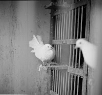
These are some shots that I did to help build a story. I am
thinking about maybe not creating contact sheets as final prints as it is getting
really difficult to create a contact sheet that I am happy with, but rather
create a series of images that tell a story. So the purpose of these images is to help that happen.
Again this was another attempt at a shot that put the image
into perspective, but this time I decided to switch sides and have my dad with
his back to the shed instead. I like this outcome more as the shed and his pigeons
are really the main focus that I wanted to capture. However again the lighting on the subject is shocking and
half his face is really bleached out. This may be due to the time I did the
shoot. I don’t know but I don’t like it, and I think it will be really hard to
print in the darkroom.
Variation of the same image, just a change in style and look.
So this image I like but I just have a feeling, although it is natural, it just
comes across as a bit posed, and I don’t like that at all.


No comments:
Post a Comment