Monday, 12 May 2014

The term "Iconic"

You will always run into problems when you are undergoing a project of some sort. But the main one I am facing throughout this brief is defining what the term “Iconic” really is and means.


^^^^^^^^
this my friends HAS NOT HELPED!!!!

Icons Of Music


BLONDDIEEEE such a babe!!! But seriously how amazing is this album cover. The composition is great, the way that Debbie Harry is stood in the front looking serious in all white, with the men behind in black suits. This reflects the actual background. Also the use of the red writing really stands off the black and white background. I think that front studio flash will have been used as there isn't harsh shadows. The subject’s faces are really clear and lit well. 


At work i'm referred to by the men who come into the club as ‘Amy Winehouse’ so I think that they would love it if I was to do this album cover ha. I think that this is an iconic cover because of the turbulent life that she lived and also the loss of it. Her music is iconic because of her unique sound. The styling is simple and the soft lighting really adds a glow to her face. The location isn't too complicated and looks to be something that can be recreated if needed.  I feel like this image could be a hero, because of her amazing voice. But also a villain due to the demons she faced with drug abuse, and also how she died.     

Examples:

Below are some examples of album covers that have been recreated. What I like about these is that it shows that they don’t have to be identical, but they have to have resemblance. And its best to use an iconic album cover that people can clearly say “oh that looks like ….” 

The link shows a web page that has images of famous and iconic album covers that have been re-created. This is very interesting and some are amazingly accurate. I like this because I LOVE music and what it represents and how it is used to express views. I would really like to try and re-create an album cover.


Myra Hindley


"Hindley, branded the 'most hated woman in Britain', was jailed for life in May 1966 for the barbaric murders of Lesley Ann Downey, 10, and Edward Evans, 17."

"She was also an accessory to the horrific murder of John Kilbride, 12, by Brady."


When I think of the words ‘evil’ and ‘villain’ I straight away think of Myra Hindley. Her face and iconic mug shot is the epitome of evil. I think that this image is known by everyone in the united kingdom, if not the world. She did horrific and unthinkable things that got her branded as the ‘most hated woman in Britain’. 

Recreating the image:

I think that this image would be quite simple to recreate. As it is a mug shot, the pose and styling is basic. Its simple and something that I think could be re-produced. The shadows created really define her cheeks and make them look sharp and harden her face. This is really important and may need to use make up to do this. The lack of catch lights in her eyes really make her seem evil and dead, also kind of like she has no soul.  

Something I found:   

When I was hunting the internet for villains that I could research I thought about Myra Hindley. Shes the most iconic British female villain and her mug shot is something everyone is familiar with. So when I looked the image up I came across this of Katie Price or ‘Jordan’ (however you would like to relate to her). Unlike Myra she hasn't done anything horrific like murdering innocent children, but she has some how been labeled as ‘the most hated woman in Britain’. So an Irish artist has created this image of Katie Price as the iconic Myra Hindley figure.    


"Let's hope Katie Price can also gain back the public's favour after becoming a national hate figure during her split with Peter Andre. Irish artist Kevin Sharkey revealed his image of Katie Price merged with Myra Hindley after hearing she was voted Britain's most hated woman in a poll. The piece will be on display as part of new Dublin exhibition Public Enemy Number One."

My Selfie Shoot

For my ‘Selfie’ shoot I already had inspiration from a couple of images from photographers such as Ellen Von Unwerth and Corrine Day. So I knew what I was hoping to get from the shoot.     

Part One - 


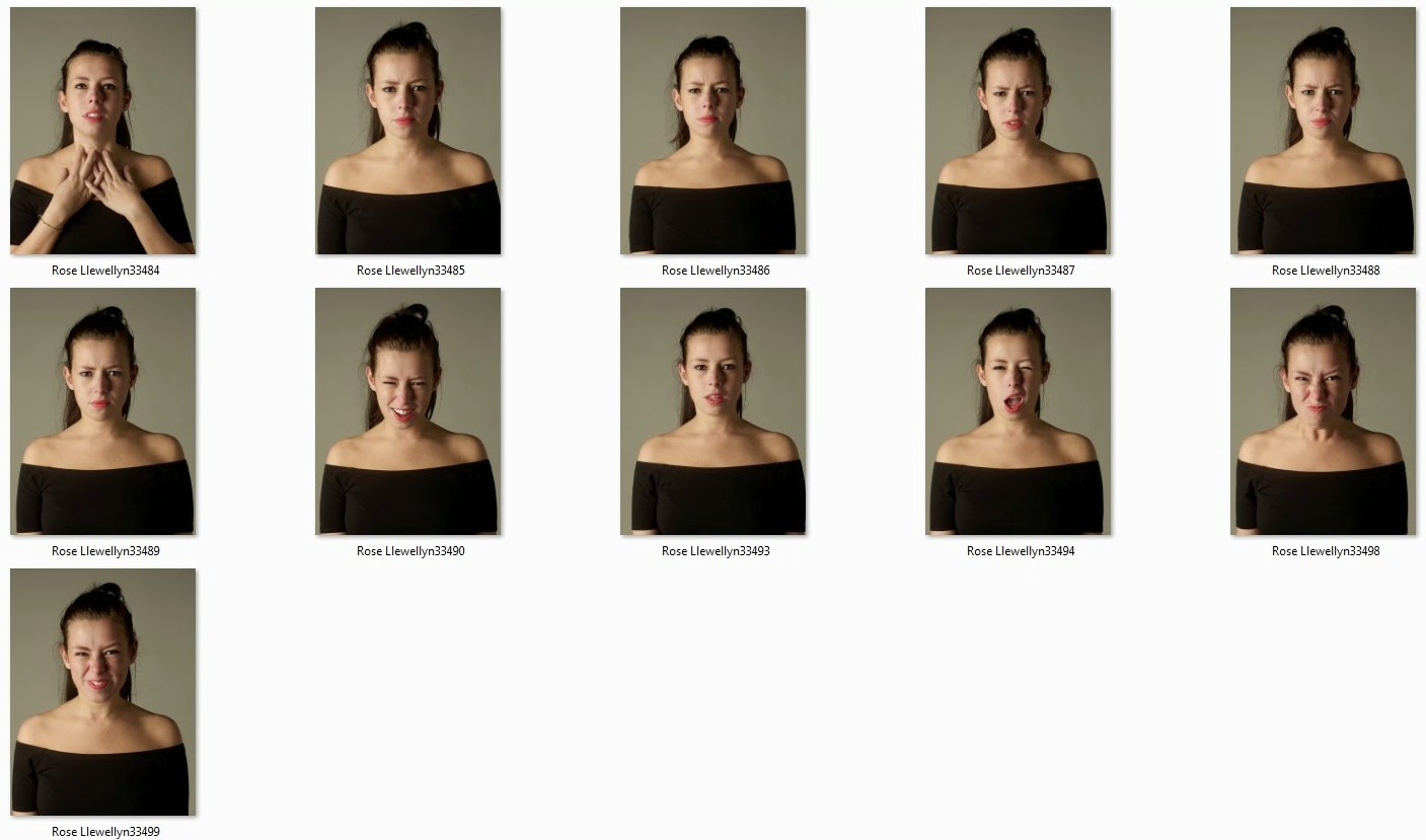
Part one of this shoot was to just capture a normal, natural selfie. I wanted the lighting to be quite subtle but still creating some nice soft shadows.  I wanted the styling to also be really simple. I don’t wear a lot of makeup so that is why my hair and makeup as minimal, I want it to be a true representation of me and my features, that’s why I didn't add anything that I wouldn't normally use. (eg hair hall fancy or loads of make-up). This would be the first image on my page what would then progress into a screaming shot.    

Part Two - 


Part two of the shoot, the aim was to have an angry face. Something that shows I’m not happy and something that you might get to slightly see in me on a day to day, but overall something I try to hide. I wanted the composition, framing and lighting to be exactly the same as the first image, the only slight difference is a bit more of an intense facial expression. I played around with a couple of different expression so I had a choice when it came to editing my images together.  

Part Three - 


My third and final image for this selfie was to capture a really frustrated image of myself. I had a few different ideas that I wanted to try out what included screaming, and also shaking my head. I thought about overlaying images to create an almost double exposure that looked slightly demonic or possessed, however after looking over the images I don’t think it would work as well and I didn't really want to take that route.    

Best Images in B+W - 


I changed all the images to black and white as I think that it works so much better. I like the tones more and I think it makes the 3 images really work together. These are the 3 images that I have chosen for my final image. I want to show a progression from a natural look into a frustrated scream, this is to portray how I feel about my life at this moment.  

Framing - 


Framing this image was really rather complicated. Not only did I need to get the measurements between the images correct, I also needed to try and line the images up so that the eyes were in the same place, the shoulders were and also the top/neck line. To do this I used the guides on Photoshop to help me. This made it easier but began to get more confusing the more guides I used. However this was necessary to make sure the image looks the best it could and was lined properly. I also wanted the images to be small with a lot of negative space around them, really reflecting my inspiration from Ellen Von Unwerth. 

Final Image - 


I am really happy with my final image and I think that it portrays what I wanted for my ‘selfie’. it shows you what I feel and maybe what you don’t see/expect. 

Wednesday, 7 May 2014

An iconic image of an icon, recreated by an icon?? … Yehhh you read that right!!

The reason that I though these images were perfect for research is that they are doing exactly what I have to. They are taking an already iconic image and recreating it. They have done it so well and really got into character. Sadly I don’t know all the photographers names as I found these when roaming the internet. 

(originals are on the left)       


Brigitte Bardot    -      Gisele Bundchen

The image of Brigitte Bardot has been recreated by a famous model to become a cover for a magazine. This is interesting, I don’t know why they would choose to do this ?!? but anyway, the image is a lot brighter than the original, what I don’t like, I think that this makes the image loose character and and makes it look a bit cheap. It also looks slightly boring. I'm not a fan of this recreation. However it doesn't look so plain when it has been made into a cover (shown below) however still not as good as the original in my opinion. 


Jayne Mansfield & Sophia Loren     -   Anna Nicole Smith (for Guess) 

The recreation of this image using Anna Nicole smith looks a lot more like a studio shot. The lighting is more flattering and the image looks posed unlike the original (obviously it is posed as it’s a recreation of an iconic image but what I mean is that It doesn't look as natural as the original). The attention to detail however when it comes to the pose and styling is amazing. They have really planned the image out to show the clear resemblance to the original.  


Unlike the other two images that I have looked at I think that this one shows a lot more individuality. The image isn't exactly the same and although the clear inspiration is there the recreation has a lot more personality and character unique to its own.        

What I have noticed about the newer, recreation images is that they are a lot sharper, and look cleaner. Maybe this is because the originals were shot on film possibly? And the others digital? This is something I find interesting. If you are recreating the image down to the last detail shouldn't you really copy the technique as well?         

My Mams Crazy!!!!


ME: “mam I have a new project and im not sure where to start or what to do”

MAM: “what is it”

ME: “have to create iconic images of heroes and villains”

MAM: “I have an idea, why don’t you do Princess Diana outside the Taj Mahal?”

ME: “are you joking me, or are you going to pay for the flight back to India”


I don’t think she actually got what I was trying to say, and wanted to do, thanks for the NOT SO useful help mam!!!

However this is a really iconic image of one of the most amazing women to grace the planet. i just think clearly this would be way to hard to try and recreate. 

Corinne Day


I'm sure I have used this in research on a number of occasions before but this would be a perfect example of how I would like my selfie to look. Showing different emotions. However I really want to get the torment of being tied down across so maybe similar to this but not as many images as it might become to overpowering.