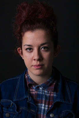
I wanted this lighting set up to be really dark. The model almost appearing out of the shadows. I didn't use any lighting on the back of the model or the back drop its self. I used the same lighting set up as another shoot. Just a simple light with a soft box attachment positioned high on the left hand side of the models face.
1 2
3 4
5 6
7
- Image is really bright. Can see loads of detail of what is in the background (crease in the back drop) Also the models face looks really bleached and shiny. I don't like this shot at all.
- Models eyes are closed. Again really bright/harsh lighting on her face. Just not usable at all i don't think.
- Maybe looks a bit blue but is starting to become what i would like. Need to set the colour white balance on light room. Also need to try and produce a better catch light in the models eyes.
- Same again no catch light at all in the models eye. Really makes the image lifeless. This is something i think is a necessity to have. The lighting however appears to be getting slowly better.
- Far too dark. Loose the model almost and again white balance is way off. Also don't like the framing of the model in the shot. Head in in centre what i don't really like think it makes her look stumpy.
- Very cold. Nice framing i think maybe would be able to make this really nice in light room.
- I cant really make my mind up on this image. I'm not too sure if she is too far down the frame of the image and that she maybe too far away from the camera her shoulders look really broad too what is not at all what she is like. I cant decide if i like it.
Catch Lights:
The most important part for me to get when shooting images for this project is a catch light in the models eye. This proved really hard in this shoot and i don't know why. No matter where i positioned the light i don't know why i just struggled to catch one that was really noticeable (what is what i wanted)
below shows the first couple attempts and how the catch light worked on the majority of the images. and then image 2 shows the best that i got. I think with out this the image just looks flat and dead. That's why i really wanted something in the eyes to give it a bit of life.
 |
| 1 |
 |
| 2 |
Favourite image from shoot:
I have chosen this as a possible final image because i think that there is a clear catch light in the models eye that makes them pop out the image and make it less flat and lifeless. Also you can see where the model is on the page she isn't lost into the background. There isn't much negative space around her she takes up the majority of the frame making her clear and the main focus. Its bright and has nice lighting without making her face look to contrasting. The exposure seems correct doesn't have a dark or blue look to it.


No comments:
Post a Comment