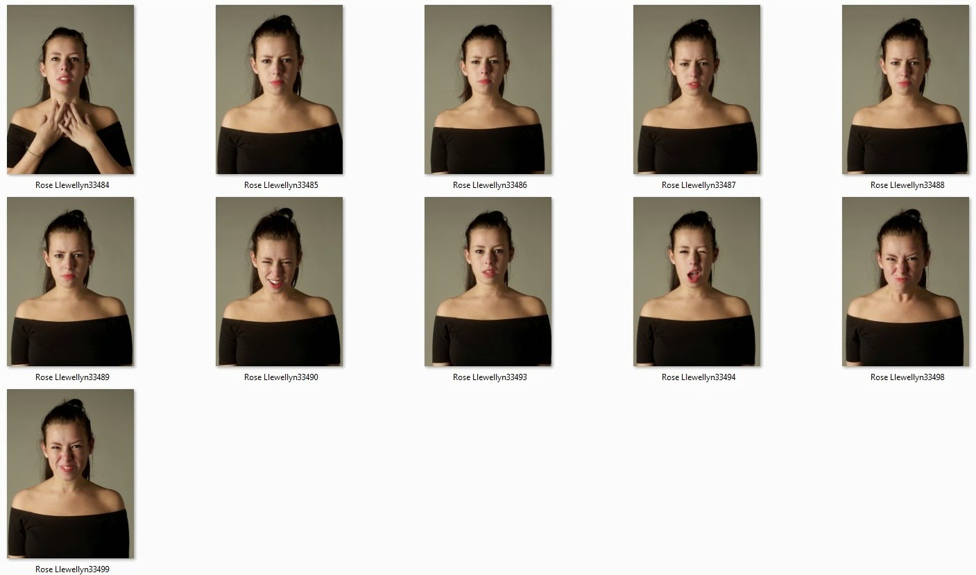
For my ‘Selfie’ shoot I already had inspiration from a
couple of images from photographers such as Ellen Von Unwerth and Corrine Day. So
I knew what I was hoping to get from the shoot.
Part One -
Part
one of this shoot was to just capture a normal, natural selfie. I wanted the
lighting to be quite subtle but still creating some nice soft shadows. I wanted the styling to also be really simple. I don’t wear a lot of makeup so that is why my hair and makeup as minimal, I want it to be a true representation of me and my features, that’s why I didn't add anything that I wouldn't normally use. (eg hair hall fancy or loads of make-up). This
would be the first image on my page what would then progress into a screaming
shot.
Part Two -
Part two of the shoot, the aim was to have an angry face. Something
that shows I’m not happy and something that you might get to slightly see in me
on a day to day, but overall something I try to hide. I wanted the composition,
framing and lighting to be exactly the same as the first image, the only slight
difference is a bit more of an intense facial expression. I played around with a couple of different expression so I had
a choice when it came to editing my images together.
My third and final image for this selfie was to capture a
really frustrated image of myself. I had a few different ideas that I wanted to
try out what included screaming, and also shaking my head. I thought about overlaying
images to create an almost double exposure that looked slightly demonic or possessed,
however after looking over the images I don’t think it would work as well and I
didn't really want to take that route.
Best Images in B+W -
I changed all the images to black and white as I think that
it works so much better. I like the tones more and I think it makes the 3
images really work together. These are the 3 images that I have chosen for my
final image. I want to show a progression from a natural look into a frustrated
scream, this is to portray how I feel about my life at this moment.
Framing -
Framing
this image was really rather complicated. Not only did I need to get the
measurements between the images correct, I also needed to try and line the
images up so that the eyes were in the same place, the shoulders were and also
the top/neck line. To do this I used the guides on Photoshop to help me. This
made it easier but began to get more confusing the more guides I used. However this
was necessary to make sure the image looks the best it could and was lined
properly. I also wanted the images to be small with a lot of negative space
around them, really reflecting my inspiration from Ellen Von Unwerth.
Final Image -
I am really happy with my final image and I think that it
portrays what I wanted for my ‘selfie’. it shows you what I feel and maybe what
you don’t see/expect.


No comments:
Post a Comment